
 Categories


Imagine you’re sitting in front of your laptop, a cup of coffee on the desk, and a new web design project in front of you. You’ve been given the creative freedom to craft the layout of an exciting new website, and you’re all geared up to dive into the process. But as you start laying out the structure, a common question pops into your mind: Should you use Flexbox or Grid for this project? Both tools have earned their place in the web development community, but which one should you pick?
Exploring a career in Web Development? Apply now!
It’s not an easy decision, and if you’ve ever wondered which one to choose for your next project, you’re not alone. Both CSS Flexbox and CSS Grid offer unique advantages, but their differences in how they handle layouts can make all the difference in your designs. So, in this blog post, we’ll walk you through the differences between these two powerful layout systems, when to use them, and how they can change the way you build websites. By the end of this post, you’ll have a solid understanding of when to use Flexbox and when Grid should take the lead.
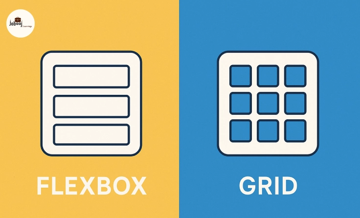
Understanding CSS Flexbox: Flexibility at Its Best
Let’s start with Flexbox, a tool designed for one-dimensional layouts. Picture this: you’re arranging items in a row or column, trying to distribute the available space evenly or align them in a way that feels intuitive and visually pleasing. This is exactly what Flexbox excels at.
Flexbox allows you to create flexible, responsive designs by adjusting the layout of your items based on the available space. It’s all about flexibility. Whether you want items to stretch, shrink, or be spaced evenly across a row or column, Flexbox gives you the power to manipulate the layout without complex calculations.
For instance, if you’re designing a horizontal navigation bar with buttons that need to adjust according to screen size, Flexbox can automatically distribute the buttons evenly, ensuring they don’t overflow or leave awkward gaps. Similarly, if you're creating a card layout where items should be aligned vertically, Flexbox makes it easy to ensure that the elements are perfectly aligned, regardless of their content size.
In short, Flexbox is a flexible, responsive tool that’s easy to grasp and excellent for smaller, simpler layouts where you need to align items in a single direction.
What About CSS Grid? A Whole New Level of Control
While Flexbox is fantastic for simpler layouts, CSS Grid takes things to a whole new level. Grid is a two-dimensional layout system, which means it allows you to work with both rows and columns simultaneously, giving you more control over how your content is organized.
Think of Grid like a giant sheet of graph paper. You can divide the page into rows and columns, and then place items exactly where you want them within this grid. You have the ability to control the size, position, and spacing of each item with precision, making it ideal for building more complex, structured layouts.
For example, imagine you’re designing a landing page with several sections: a header, a sidebar, a main content area, and a footer. With Grid, you can define the layout of these sections in a precise way, making sure each element is perfectly placed. You can even make certain elements span multiple rows or columns, giving you flexibility while maintaining structure.
CSS Grid is the tool you need when you’re dealing with larger projects that require complex arrangements, like dashboards, product galleries, or magazine-style layouts. It offers greater flexibility and control than Flexbox when you're working with multiple elements in both directions.
Flexbox vs Grid: A Side-by-Side Comparison
While both Flexbox and Grid have their advantages, they serve different purposes. Here's a breakdown of their key differences:
Flexibility vs Structure:
-
Flexbox is excellent for one-dimensional layouts, where you need to arrange items in a single row or column. It excels in simplicity and is often the go-to choice for basic designs.
-
Grid, however, is the king of two-dimensional layouts. It handles both rows and columns simultaneously, making it perfect for more structured, complex layouts.
Use Case Scenarios:
-
Flexbox works wonders for smaller, simpler layouts where alignment is the main goal. For example, a navigation bar, a simple grid of images, or a form with evenly spaced fields.
-
Grid shines when you need a more complex structure with items spanning across both rows and columns. For example, designing a full-page layout, a product page with multiple rows and columns, or even a dashboard layout.
Control and Precision:
-
Flexbox gives you control over the arrangement of items within a row or column, but when it comes to positioning multiple elements across both axes, it falls short.
-
Grid offers far more control over your layout’s structure, letting you define specific grid areas and control the spacing between elements precisely.
Ease of Use:
-
Flexbox is easier to learn and use for beginners because it deals with only one direction at a time. It’s simple to set up and intuitive for creating flexible, one-dimensional designs.
-
Grid comes with a slightly steeper learning curve due to its two-dimensional nature, but once you get the hang of it, you’ll appreciate the immense power it gives you for building complex layouts.
When Should You Use Flexbox?
As we’ve seen, Flexbox is great for simple, flexible layouts. You should consider using it when:
-
You’re working with a one-dimensional layout (either rows or columns).
-
You need alignment of items, whether horizontally or vertically.
-
You’re designing a responsive layout where items need to adjust and reflow based on the screen size.
-
You’re creating smaller-scale layouts, such as a footer with links, a horizontal navigation menu, or a column of items.
When Should You Use Grid?
On the other hand, CSS Grid should be your go-to choice for more complex, structured layouts. It’s perfect for situations where:
-
You need control over both rows and columns simultaneously.
-
You’re building a responsive, multi-column layout, like a blog layout or a product gallery.
-
You have a large-scale design that involves precise placement of elements, such as a dashboard or a portfolio page.
-
You need to make elements span across multiple columns or rows, giving you more flexibility in how you arrange your design.
Conclusion
Choosing between Flexbox and CSS Grid ultimately depends on the nature of the project you’re working on. If you’re designing a simple, one-dimensional layout where flexibility and responsiveness are key, Flexbox is your best bet. On the other hand, if your project requires more control over both rows and columns and involves complex layout structures, CSS Grid is the clear winner.
The good news is that Flexbox and Grid are not mutually exclusive. In fact, you can use both together in a single layout to leverage the strengths of each. For example, you could use Grid to create the overall page layout and Flexbox to arrange items within individual sections. The key is to understand when and how to use each tool effectively to create responsive, flexible, and beautiful designs.
Dreaming of a Web Development Career? Start with Web Development Certificate with Jobaaj Learnings.


