Categories


It was a typical Monday morning when Jane, a data analyst, was sitting in front of her computer, scrolling through rows and rows of raw data. She had been given the task of presenting her findings in a way that would help her team understand the trends and patterns hidden within the numbers. The problem was, the data was too complicated—too many numbers, too many variables.
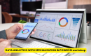
Exploring a career in Data Analytics? Apply Now!
Then, it clicked. Data visualization. She realized that transforming this data into graphs, charts, and interactive dashboards could speak volumes more than a hundred raw numbers ever could. And with that thought, she turned to her trusty collection of data visualization tools. By the end of the day, Jane had crafted an interactive dashboard that not only presented the data but told a story that was clear, engaging, and actionable.
This is the power of data visualization—it turns complex data into something understandable and actionable. In today’s world, data visualization is a game-changer for analysts, marketers, business owners, and anyone else who deals with data. So, how do you choose the right tool for your needs? Let’s explore the top 7 data visualization tools that are helping professionals like Jane transform their data into insightful stories.
1. Tableau: The Powerhouse of Data Visualization
Tableau has become a household name in the world of data visualization, and for good reason. Whether you’re a beginner or an expert, Tableau offers a user-friendly platform that allows you to create interactive visualizations with ease.
When to Use Tableau:
When you need to visualize large sets of data quickly.
For interactive dashboards that can be shared across teams or clients.
When you want to integrate with multiple data sources, from Excel to SQL databases.
Tableau’s drag-and-drop functionality, combined with its powerful visualization capabilities, makes it a top choice for professionals in finance, marketing, healthcare, and beyond.
2. Microsoft Power BI: Budget-Friendly and Accessible
Power BI is another excellent tool that seamlessly integrates with other Microsoft Office products, especially Excel. It’s known for its affordable pricing and ease of use—perfect for businesses on a budget that need a reliable tool without breaking the bank.
When to Use Power BI:
When you're already using Microsoft products, especially Excel.
If you need to create custom reports and dashboards without a steep learning curve.
For businesses that want to easily share insights within an organization.
Power BI’s integration with Microsoft Office makes it ideal for businesses looking for a simple, cost-effective solution to turn their data into dynamic visual insights.
3. Google Data Studio: The Free Option for Simple Visualizations
Google Data Studio offers a free, web-based solution for data visualization. It’s perfect for those who need to create basic charts, graphs, and dashboards without needing to learn complex tools. It’s also great for teams that need to share reports and insights across different platforms.
When to Use Google Data Studio:
When you're working with Google Analytics, Google Ads, or other Google products.
For basic dashboards or visualizations that don’t require a lot of advanced features.
If you're looking for a free tool for visualizing data without major features.
Although it’s less robust than some other tools on this list, Google Data Studio is perfect for small businesses or teams just starting out with data visualization.
4. D3.js: Customization at Its Best
D3.js is a JavaScript library for producing dynamic, interactive data visualizations in web browsers. It gives you complete control over your visuals, allowing you to create customized visualizations that meet your specific needs.
When to Use D3.js:
When you need to create highly customized visualizations.
If you’re familiar with coding and want full control over the design.
For complex data that needs creative or unique visualizations.
If you have the technical skills, D3.js offers nearly limitless possibilities for creating bespoke visualizations that will make your data stand out in a unique way.
5. Qlik Sense: A Self-Service Tool for Big Data
Qlik Sense is an analytics tool designed for self-service data exploration. It’s powerful when it comes to working with large datasets and enabling data discovery through interactive visualizations.
When to Use Qlik Sense:
When you need to explore big data with self-service capabilities.
If you’re interested in creating interactive dashboards that allow users to drill down into data.
For businesses that want to empower employees to create their own visualizations.
Qlik Sense is particularly useful for teams that want to explore data independently and uncover insights through a user-friendly interface.
6. Looker: Advanced Data Exploration and Visualization
Looker, now owned by Google Cloud, is known for its ability to handle complex datasets and provide deep insights. It offers a flexible data model that enables advanced data exploration and visualization for teams across different departments.
When to Use Looker:
When you need to analyze large datasets in real time.
If you're looking for advanced data exploration capabilities.
When you need to integrate visualizations with other applications or cloud services.
Looker is ideal for organizations that require advanced capabilities and wish to integrate visualizations with their business processes.
7. Plotly: The Best for Interactive Graphs
Plotly is a graphing library that allows you to create interactive plots and dashboards. It is widely used by data scientists, researchers, and engineers because of its ability to handle complex visualizations with a high level of interactivity.
When to Use Plotly:
When you need to create interactive graphs and dashboards.
For use in data science or engineering projects that require advanced charts.
When you need real-time data visualizations for analysis.
Plotly is ideal for teams that need to go beyond static charts and create interactive visualizations that can engage users at a deeper level.
Conclusion: Choose the Right Tool for Your Needs
In the world of data visualization, the right tool can transform your data from mere numbers into actionable insights. Each tool has its strengths, whether it's the simplicity of Google Data Studio, the power of Tableau, or the customization of D3.js.
Choosing the right tool depends on your needs, the complexity of your data, and how much customization you require. But no matter which tool you choose, mastering data visualization will undoubtedly enhance your ability to communicate insights effectively, make better decisions, and unlock the true potential of your data.
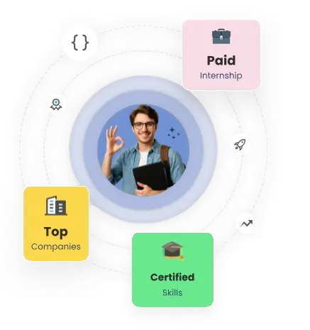
Dreaming of a Data Analytics Career? Start with Data Analytics Certificate with Jobaaj Learnings.