Categories


Every company has data. Very few people know how to turn that data into a clear story.
That is where data visualization becomes powerful. It helps businesses understand sales, customers, marketing, finance, operations, product performance and user behaviour through charts, dashboards and visual reports.
For students, data visualization is one of the most practical skills to learn because it does not require you to become a hardcore coder from day one. You can start with Excel, Power BI, Tableau or Looker Studio and slowly move into SQL, Python and advanced analytics.
But there is one problem.
Watching tutorials is not enough. Recruiters want proof. They want to see what you can build, how you think, how you clean data, how you choose charts and how you explain insights.
That proof comes from a strong data visualization portfolio.
This blog will give you detailed data visualization portfolio project ideas, career scope, salary expectations, skills required, tools to learn, job roles, eligibility and future opportunities.
If you are a student exploring creative career options, this is one of the best fields where creativity, business thinking and analytics come together.
What Is Data Visualization?
Data visualization is the process of presenting data in a visual format such as charts, graphs, maps, dashboards, reports and infographics.
Instead of reading thousands of rows in Excel, a decision-maker can look at a dashboard and quickly understand what is happening.
For example:
A sales dashboard can show which product is performing best.
A marketing dashboard can show which campaign is bringing leads.
A finance dashboard can show profit, loss and expenses.
A student performance dashboard can show attendance, marks and improvement trends.
Good data visualization is not about adding colourful charts everywhere. It is about making data easier to understand and easier to act on.
Best Software and Tools for Data Visualization
Here are the most useful tools students can learn.
|
|
|
|
|
|
|
|
|
|
|
|
|
|
|
|
|
|
|
|
|
|
|
|
|
|
|
|
|
|
|
|
|
|
|
|
|
|
|
|
|
|
|
|
|
|
|
|
Power BI vs Tableau vs Excel
|
|
|
|
|
|
|
|
|
|
|
|
|
|
|
|
|
|
|
|
|
|
|
|
|
|
|
|
|
|
|
|
|
|
|
If you are a beginner, start with Excel and Power BI. Then learn SQL. After that, you can add Tableau or Python visualization.
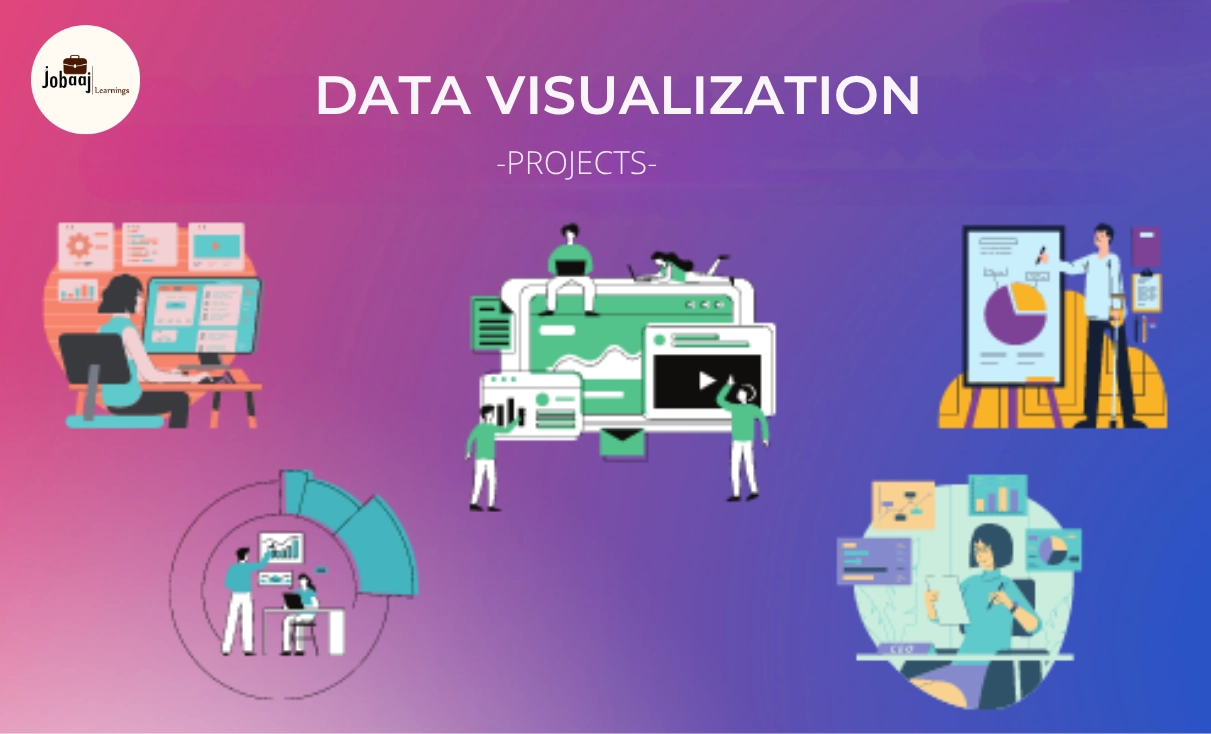
Best Data Visualization Portfolio Project Ideas
Now let’s come to the most important part: project ideas.
A good portfolio should include different types of projects. Do not create five similar sales dashboards. Show variety.
Try to include business, marketing, finance, HR, product and social impact projects.
1. Sales Performance Dashboard
This is one of the best beginner-friendly data visualization projects.
Project Goal
Create a dashboard that shows total sales, profit, region-wise sales, product-wise sales and monthly growth.
Key Metrics
Total revenue
Total profit
Profit margin
Monthly sales trend
Top products
Top regions
Sales by category
Tools You Can Use
Excel
Power BI
Tableau
2. Customer Churn Dashboard
Customer churn means customers who stop using a product or service.
Project Goal
Build a dashboard that helps a company understand why customers are leaving.
Key Metrics
Churn rate
Customer tenure
Monthly charges
Contract type
Payment method
Customer segments
Retention risk
Tools You Can Use
Power BI
Tableau
Python
SQL
3. HR Attrition Dashboard
This project is useful for students interested in HR analytics.
Project Goal
Analyze employee attrition and identify patterns based on department, salary, age, job role and work experience.
Key Metrics
Attrition rate
Department-wise attrition
Average salary
Age group analysis
Job satisfaction
Years at company
Work-life balance score
Tools You Can Use
Power BI
Tableau
Excel
4. Marketing Campaign Performance Dashboard
This is a strong project for students interested in digital marketing and analytics.
Project Goal
Track campaign performance across channels such as Google Ads, Instagram, email and organic traffic.
Key Metrics
Impressions
Clicks
Click-through rate
Conversion rate
Cost per lead
Return on ad spend
Revenue from campaign
Tools You Can Use
Looker Studio
Power BI
Google Sheets
Excel
5. E-Commerce Product Analytics Dashboard
This project is highly relevant because e-commerce companies depend heavily on data.
Project Goal
Analyze product sales, customer behaviour, order value and category performance.
Key Metrics
Total orders
Average order value
Top-selling products
Cart abandonment rate
Category revenue
Customer location
Discount impact
Tools You Can Use
Power BI
Tableau
SQL
Excel
6. Student Performance Dashboard
This project is useful for EdTech, schools, colleges and learning platforms.
Project Goal
Track student marks, attendance, course completion and performance improvement.
Key Metrics
Average score
Attendance percentage
Subject-wise performance
Pass percentage
Top-performing students
At-risk students
Course completion rate
Tools You Can Use
Excel
Power BI
Google Sheets
7. Financial Expense Dashboard
This is a good project for commerce, finance and MBA students.
Project Goal
Analyze personal or business expenses and identify spending patterns.
Key Metrics
Total income
Total expenses
Savings percentage
Category-wise spending
Monthly expense trend
Budget vs actual
Highest spending category
Tools You Can Use
Excel
Power BI
Tableau
8. Stock Market Visualization Dashboard
This project is useful for students interested in finance and investment analytics.
Project Goal
Visualize stock price movement, volume, returns and risk patterns.
Key Metrics
Opening price
Closing price
Daily return
Moving average
Trading volume
High and low price
Volatility
Tools You Can Use
Python
Power BI
Tableau
Excel
9. Healthcare Patient Dashboard
Healthcare analytics is a growing area.
Project Goal
Analyze patient appointments, diagnosis categories, hospital departments and treatment trends.
Key Metrics
Number of patients
Department-wise visits
Average waiting time
Appointment status
Patient age group
Treatment category
Readmission rate
Tools You Can Use
Power BI
Tableau
Excel
10. Food Delivery Dashboard
This project is relevant for companies like Swiggy, Zomato, Blinkit and other delivery businesses.
Project Goal
Analyze orders, delivery time, customer ratings and restaurant performance.
Key Metrics
Total orders
Average delivery time
Order value
Customer rating
Cancelled orders
Top restaurants
Peak order hours
Tools You Can Use
Power BI
Tableau
SQL
11. Social Media Analytics Dashboard
This is a good project for students interested in content, branding and digital marketing.
Project Goal
Track social media performance across platforms.
Key Metrics
Followers
Reach
Engagement rate
Likes
Comments
Shares
Post frequency
Best-performing content type
Tools You Can Use
Looker Studio
Excel
Power BI
Google Sheets
12. Netflix or OTT Content Dashboard
This is an interesting project because entertainment data is easy to understand.
Project Goal
Analyze movies and shows by genre, country, rating, release year and platform trends.
Key Metrics
Number of titles
Genre distribution
Country-wise content
Release year trend
Movie vs TV show ratio
Top categories
Content rating
Tools You Can Use
Tableau
Power BI
Excel
13. IPL or Sports Analytics Dashboard
Sports analytics projects are engaging and easy to present.
Project Goal
Analyze player performance, team performance, match results and scoring patterns.
Key Metrics
Runs scored
Wickets taken
Strike rate
Economy rate
Win percentage
Venue performance
Player comparison
Tools You Can Use
Power BI
Tableau
Python
14. Recruitment Funnel Dashboard
This project is useful for HR, recruitment and staffing companies.
Project Goal
Analyze hiring stages from applications to final selection.
Key Metrics
Total applicants
Shortlisted candidates
Interview conversion rate
Offer acceptance rate
Time to hire
Source of candidates
Rejected candidates
Tools You Can Use
Power BI
Excel
Tableau
15. Website Analytics Dashboard
This is a strong project for digital marketing and product analytics.
Project Goal
Track website traffic, user behaviour and conversion performance.
Key Metrics
Users
Sessions
Bounce rate
Average session duration
Traffic source
Conversion rate
Landing page performance
Tools You Can Use
Looker Studio
Google Analytics sample data
Power BI
Excel
16. Supply Chain Dashboard
This project is slightly advanced and useful for operations roles.
Project Goal
Track inventory, orders, suppliers, delivery delays and stock availability.
Key Metrics
Inventory level
Stockout rate
Order quantity
Supplier performance
Delivery delay
Warehouse performance
Demand forecast
Tools You Can Use
Power BI
Tableau
SQL
17. Banking Transaction Dashboard
This project is good for students interested in BFSI and fintech.
Project Goal
Analyze customer transactions, account activity and fraud-like patterns.
Key Metrics
Transaction volume
Transaction value
Customer segment
Payment mode
Failed transactions
High-value transactions
Region-wise transactions
Tools You Can Use
Power BI
SQL
Tableau
18. Startup KPI Dashboard
This is a strong project for students interested in product, business and startups.
Project Goal
Track important startup metrics in one dashboard.
Key Metrics
Monthly recurring revenue
Customer acquisition cost
Customer lifetime value
Churn rate
Active users
Conversion rate
Burn rate
Tools You Can Use
Power BI
Tableau
Excel
19. Climate Change Visualization Project
This is a good social impact project.
Project Goal
Visualize temperature change, carbon emissions, rainfall or pollution trends.
Key Metrics
Average temperature
CO2 emissions
Air quality index
Rainfall trend
Country-wise emissions
Year-wise changes
Pollution level
Tools You Can Use
Tableau
Power BI
Python
Flourish
20. Personal Portfolio Analytics Dashboard
This is a unique project where you analyze your own career progress.
Project Goal
Track your applications, interviews, skills learned, certifications and projects completed.
Key Metrics
Jobs applied
Interview calls
Skills completed
Certifications
Projects built
Application success rate
Weekly learning hours
Tools You Can Use
Excel
Google Sheets
Power BI
Salary Scope in Data Visualization
Salary depends on your skills, city, company type, portfolio, internships and interview performance.
In India, beginner data analyst and visualization roles often start around ₹3 LPA to ₹6 LPA. Candidates with strong Power BI, SQL, Excel and project portfolios can move toward better packages faster.
Mid-level professionals with 2 to 4 years of experience can often earn between ₹5 LPA and ₹12 LPA, depending on the company and role.
Senior analysts, BI developers and visualization specialists can earn ₹12 LPA to ₹25 LPA or more, especially in product companies, consulting firms, fintech, SaaS and MNCs.
Indicative Salary Range in India
|
|
|
|
|
|
|
|
|
|
|
|
|
|
|
|
|
|
|
|
|
|
|
|
|
|
|
|
|
|
|
|
These numbers are indicative. Actual salaries vary based on location, company, portfolio quality and technical depth.
How to Choose the Right Data Visualization Project
Do not pick a project only because it looks fancy.
Choose a project based on your target career.
|
|
|
|
|
|
|
|
|
|
|
|
|
|
|
|
|
|
|
|
|
|
|
|
Your portfolio should match the job you want.
If you want marketing analytics roles, do not fill your portfolio only with finance dashboards.
If you want Power BI roles, build at least two strong Power BI projects.
If you want product analytics roles, include user behaviour, retention and funnel analysis.
Roadmap to Build a Data Visualization Portfolio
Here is a simple roadmap for students.
Step 1: Learn Excel Basics
Start with formulas, pivot tables, charts, sorting, filtering and conditional formatting.
Step 2: Learn Dashboard Design
Understand layout, colours, chart types and KPI cards.
Step 3: Learn Power BI or Tableau
Pick one tool first. Do not try to learn everything together.
Step 4: Learn SQL Basics
SQL will help you work with real business data.
Step 5: Build 4 to 6 Projects
Choose projects from different domains such as sales, HR, marketing, finance and product analytics.
Step 6: Write Case Studies
For each project, explain the problem, process, dashboard and insights.
Step 7: Share Your Work
Post your projects on LinkedIn, GitHub, Notion or Tableau Public.
Step 8: Improve Based on Feedback
Ask mentors, seniors or professionals to review your dashboard.
How Many Projects Should Be in Your Portfolio?
For students and freshers, 4 to 6 strong projects are enough.
Do not create 20 average projects. Create fewer but better projects.
A good beginner portfolio can include:
One sales or e-commerce dashboard
One HR or recruitment dashboard
One marketing or website analytics dashboard
One finance dashboard
One product or customer churn dashboard
One creative/social impact dashboard
This mix shows variety.