Categories
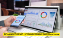


Data visualization is one of the most in-demand skills for analysts, product managers, and business professionals today. Employers want candidates who can turn raw data into actionable insights, present trends clearly, and support data-driven decisions. Working on data visualization projects is an effective way to demonstrate these skills on your portfolio or resume.
Aspiring for a career in Data and Business Analytics? Begin your journey with a Data and Business Analytics Certificate from Jobaaj Learnings.
This guide presents 15 impactful data visualization project ideas for 2026, explained clearly, so students and professionals can implement them and stand out to recruiters.
Why Data Visualization Projects Are Important
Creating visualization projects helps you:
- Apply data analysis and storytelling skills.
- Showcase proficiency in tools like Power BI, Tableau, Excel, and Python visualization libraries.
- Translate complex datasets into insights that decision-makers can act on.
- Strengthen your portfolio and make it recruiter-ready.
Effective visualizations highlight not just your technical ability but also your communication, analytical thinking, and problem-solving.
15 Data Visualization Project Ideas
1. Sales Dashboard
Create a dashboard that tracks sales across products, regions, and time periods. Use various charts and visual elements to reveal trends, identify top-performing products, and monitor overall business performance. This project helps students understand how to present complex sales data in an easy-to-understand format.
2. Customer Segmentation Analysis
Visualize customer groups based on behavior, demographics, or purchase history. This project helps students identify patterns among different customer segments and understand how businesses use data to create targeted marketing strategies.
3. Marketing Campaign Performance
Track campaign metrics such as click-through rates, conversions, impressions, and engagement. Students learn how to create interactive dashboards that highlight successful campaigns and identify areas for improvement.
4. Website Analytics Report
Analyze website traffic data, bounce rates, and user behavior to understand how visitors interact with a website. This project teaches students how to visualize engagement patterns and identify opportunities to improve user experience.
5. Social Media Insights
Visualize follower growth, engagement, reach, and audience sentiment across social media platforms. Students learn how to compare platform performance and uncover trends that can improve content and marketing strategies.
6. Stock Market Analysis
Display stock price trends, trading volume, and market indicators to gain investment insights. This project helps students understand financial data visualization and how visual tools can simplify complex market movements.
7. Financial Performance Dashboard
Track revenue, expenses, and profitability over time using an interactive dashboard. Students learn how to summarize financial performance and present key business metrics in a visually appealing manner.
8. E-commerce Analytics
Visualize product performance, customer reviews, and sales trends to identify popular products and customer preferences. This project teaches students how to extract meaningful insights from e-commerce data.
9. HR Analytics Dashboard
Show employee data such as turnover rates, performance scores, and satisfaction levels. Students learn how organizations use data visualization to monitor workforce trends and make informed HR decisions.
10. Healthcare Data Visualization
Visualize patient outcomes, disease trends, or hospital performance metrics. This project helps students understand how data visualization can support healthcare decisions and improve service quality.
11. Survey Results Analysis
Present survey data in a clear and engaging way to showcase customer opinions or employee feedback. Students learn how to organize responses effectively and highlight major findings through visual storytelling.
12. Predictive Analytics Dashboard
Combine data visualization with predictive models to display future trends and forecasted performance. This project introduces students to the concept of predictive analytics and how forecasts can aid business decision-making.
13. Project Management Dashboard
Track project milestones, tasks, deadlines, and team performance through a visual dashboard. Students learn how to monitor project progress and communicate important updates effectively.
14. Energy Consumption Analysis
Visualize electricity, water, or fuel consumption trends over time to identify usage patterns and inefficiencies. This project helps students understand sustainability metrics and resource optimization through data analysis.
15. KPI Tracker for Startups
Build a dashboard that tracks key performance indicators such as growth, revenue, customer acquisition, and retention. This project teaches students how startups monitor performance and make data-driven decisions for business growth.
Tools to Explore
- Tableau: Best for interactive dashboards and visually appealing reports.
- Power BI: Strong for integrating multiple data sources and corporate reporting.
- Excel: Good for quick visualizations, pivot charts, and dashboards.
- Python (Matplotlib, Seaborn, Plotly): Great for customizable, advanced data visualizations.
- Google Data Studio: Useful for sharing interactive dashboards online.
Mastering these tools ensures your projects are professional, interactive, and actionable.
Conclusion
Building data visualization projects is a powerful way to strengthen your analytical portfolio. From dashboards and KPI trackers to predictive analytics and interactive reports, these projects demonstrate your ability to communicate insights clearly, solve real-world problems, and make data-driven decisions.
Ready to Take the Next Step in Your Career? Apply Now!