Categories


In the world of UI (User Interface) design, color is more than just a visual element it is a powerful tool that influences user experience, perception, and behavior. From the buttons users click to the background of the screen, every color choice plays a significant role in how a user interacts with an interface. Color theory is the science and art of using color in design, and its impact on UI design cannot be overstated.
Exploring a career in Web Development? Apply now!
In this blog, we will delve into why color theory is essential in UI design, how it can enhance the user experience, and the psychological effects different colors have on users. Whether you're a seasoned designer or a beginner, understanding color theory is crucial to creating aesthetically pleasing and functional interfaces that drive user engagement and satisfaction.
What Is Color Theory in UI Design?
Color theory in UI design involves the study of how colors interact with one another and how they can be used effectively in user interfaces. It combines principles of aesthetics, psychology, and visual design to help designers select colors that are both visually appealing and functionally effective.
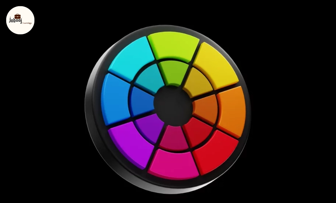
Key elements of color theory include:
- Color Wheel: The circular arrangement of primary, secondary, and tertiary colors used to understand color relationships.
- Complementary Colors: Colors that are opposite each other on the color wheel, creating high contrast and making elements stand out.
- Analogous Colors: Colors that are next to each other on the color wheel, providing a harmonious and cohesive look.
- Triadic Colors: Colors that are evenly spaced around the color wheel, creating vibrant and balanced designs.
- Tints, Tones, and Shades: Variations of a color achieved by adding white, gray, or black to the base color.
Understanding how to apply these concepts in UI design can elevate the user experience and create designs that are not only visually striking but also functional and easy to navigate.
Why Is Color Theory Important in UI Design?
1. Enhances User Experience (UX)
Color is not just about aesthetics; it plays a major role in user experience (UX). Thoughtful color choices can improve usability, reduce friction, and guide users through the interface. For example, using contrasting colors for call-to-action buttons makes them stand out, encouraging users to take action.
- Example: A red button on a white background immediately draws attention, signaling urgency or importance. This is commonly seen in e-commerce websites with "Add to Cart" or "Buy Now" buttons.
2. Establishes Brand Identity
Colors can help establish a brand’s identity and make it instantly recognizable. For instance, blue often conveys trust and reliability (e.g., Facebook), while green can symbolize eco-friendliness or growth (e.g., Spotify). Using the right color palette can help users quickly identify a brand and create an emotional connection.
- Example:Apple uses sleek, minimalistic design with a neutral color palette of white, black, and gray, reinforcing their brand's emphasis on simplicity and innovation.
3. Improves Accessibility and Readability
Colors are not just for design but also play a significant role in accessibility. Using proper color contrast between text and background is essential for making sure that content is readable for users with visual impairments, such as color blindness. Accessible color choices ensure that all users, regardless of ability, can engage with the interface.
- Example: Ensure that text has enough contrast with its background. Black text on white background provides the highest level of readability, while light yellow text on light green may be difficult for people with color blindness to read.
4. Evokes Emotional Responses
Colors have the ability to evoke certain emotions and psychological responses. For example, warm colors like red, orange, and yellow can stimulate energy and excitement, while cool colors like blue, green, and purple can induce calmness and trust.
- Example: In healthcare UI design, blue is often used for calming and trustworthy associations, while green symbolizes health, well-being, and safety.
5. Provides Visual Hierarchy
Color can help create a visual hierarchy within an interface. By using different shades and contrasts, you can draw attention to key elements and guide the user's eye to the most important information. This helps users navigate the interface more easily and efficiently.
- Example: A dark blue navigation bar at the top of the page with lighter blue text links can create a clear visual distinction, making it easy for users to locate navigation options.
How to Apply Color Theory in UI Design?
1. Choose a Color Palette
Start by selecting a color palette that aligns with the brand identity and the message you want to convey. A 3-5 color scheme is usually sufficient for most designs, and it should include primary, secondary, and accent colors.
Use tools like Adobe Color or Coolors to generate color palettes that are harmonious and balanced.
2. Consider User Psychology
Different colors evoke different emotions, so it’s important to think about how the colors you choose will impact user behavior. For example, green is calming and associated with nature, while red can create a sense of urgency.
Think about your audience and the kind of action you want to inspire. Use colors strategically to encourage clicks or guide decisions.
3. Test for Contrast and Accessibility
Make sure that there is enough contrast between text and background colors to ensure readability. Web Content Accessibility Guidelines (WCAG) provide specific recommendations on color contrast to ensure accessibility for all users.
Use online tools like WebAIM's Contrast Checker to verify the contrast ratios of your color choices.
4. Create Consistent and Simple Visuals
While it’s tempting to use many colors, simplicity often works best. Stick to a consistent color scheme and use colors to differentiate elements like buttons, links, and headings.
Use neutral tones (like gray, white, and black) for backgrounds and main content, with accent colors for calls-to-action, links, or navigation.
5. Apply Color Theory Across Platforms
Ensure that your color choices look good on different devices, screen sizes, and lighting conditions. Colors can appear differently on mobile screens, desktop monitors, and in various lighting environments, so test your designs across multiple platforms.
Use responsive design principles to adjust how your colors display across devices and ensure consistency.
Conclusion
Color theory is a powerful tool that enhances UI design, improves user experience, and fosters stronger emotional connections with users. Whether you are designing a website, mobile app, or any other digital interface, understanding and applying color theory can help you create visually appealing, functional, and accessible designs. By using color effectively, you can improve readability, enhance engagement, and ensure your design stands out in a crowded market.
If you haven’t already, make color an essential part of your design process. It’s not just about looking good; it’s about creating experiences that delight users and drive them to take action.
Dreaming of a Web Development Career? Start with Web Development Certificate with Jobaaj Learnings.