Categories


Imagine this: you're sitting at your desk, looking at a sea of numbers and data, trying to make sense of it all. Your goal is to present this information in a way that not only looks great but also provides clear insights that can help drive decisions. You start thinking, “How can I present all this data in a more accessible and visually appealing way?” The answer is simple—by building a data dashboard.
Exploring a career in Data Analytics? Apply Now!
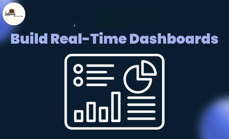
A data dashboard is a powerful tool that allows you to visualize and interact with your data, making it easier to draw conclusions and make informed decisions. But building a dashboard can feel like a daunting task, especially if you’ve never done it before. In this guide, we’ll walk you through the process of building your very first data dashboard, from selecting the right tools to designing and visualizing your data. Let’s dive in!
1. Define Your Purpose and Audience
Before jumping into building a dashboard, it’s essential to understand the purpose of the dashboard and who will be using it. Are you creating it for personal use, or will it be presented to a team or executives? The audience will determine how complex your dashboard should be and what kind of data to include.
Key Questions to Consider:
-
What data are you analyzing?
-
What key metrics do you need to display?
-
Who will use the dashboard, and what decisions will they need to make from it?
For instance, if you are building a dashboard for a marketing team, your focus might be on KPIs like website traffic, conversion rates, and social media engagement. However, for a sales team, you might want to display sales performance metrics like revenue, targets, and growth.
2. Select the Right Data and Tools
The next step is to gather the data you’ll need for the dashboard and choose the tools that will help you build it. You can use various data sources like databases, Excel files, or Google Sheets. Tools like Tableau, Power BI, and Google Data Studio are excellent for creating interactive dashboards.
Data Sources:
-
Excel/CSV files: Simple and effective for smaller datasets.
-
SQL databases: Ideal for large datasets or structured data.
-
APIs: If you're pulling real-time data from services like Google Analytics, Twitter, etc.
Dashboard Tools:
-
Tableau: Known for its easy drag-and-drop interface and powerful visualization options.
-
Power BI: Ideal for users already familiar with Microsoft products, offering deep integration with Excel.
-
Google Data Studio: Great for beginners and free to use with easy Google Analytics and Sheets integration.
3. Design Your Dashboard Layout
Once you have your data and tools ready, the next step is to design the layout of your dashboard. This is where you’ll decide how to display the information clearly and visually.
Tips for Dashboard Design:
-
Keep it simple: Avoid clutter and focus on the most important metrics.
-
Use appropriate visualizations: For example, use bar charts for comparisons, line charts for trends, and pie charts for proportions.
-
Create a logical flow: Arrange the elements of the dashboard in a way that tells a clear story. Typically, important KPIs should be placed at the top or center, with less critical data towards the bottom or sides.
4. Build the Dashboard
Now comes the exciting part: building your dashboard! Using the tools you've selected, you’ll begin visualizing your data. Here’s a basic workflow to follow:
a) Connect Your Data Source: Link your data source to the dashboard tool (e.g., connecting your Excel file or database to Tableau).
b) Choose Your Visualizations: Based on your design and metrics, choose the appropriate visualizations (e.g., bar charts, line graphs, heat maps).
c) Add Filters: Adding interactive filters (like date ranges or categories) will allow users to drill down into specific details.
d) Customize the Look: Make your dashboard visually appealing by adjusting colors, fonts, and styles to ensure it's both functional and aesthetically pleasing.
5. Test and Refine
Once your dashboard is built, it’s time to test it. Does it work as expected? Does it display the correct data? Are the visualizations intuitive?
Things to Test:
-
Interactivity: Ensure that all filters and controls are functioning properly.
-
Data accuracy: Double-check the data that appears on your dashboard to ensure it's accurate and up-to-date.
-
User experience: Ask others to use the dashboard and get their feedback on the design and usability.
6. Publish and Share
After testing and refining your dashboard, it’s time to share it with your team, clients, or stakeholders. Many tools like Tableau and Power BI allow you to publish dashboards online, while others allow you to export them as PDFs or interactive links. Make sure your audience can access the dashboard easily and can interpret the data effectively.
Conclusion
Building your first data dashboard doesn’t have to be overwhelming. By following a structured approach—starting with defining your audience and purpose, selecting the right data and tools, designing an intuitive layout, and testing thoroughly—you’ll create a powerful tool for data visualization that can help drive business decisions. As you continue to practice and experiment with different tools and designs, your skills in data analysis and visualization will only improve. Happy dashboard building!
Dreaming of a Data Analytics Career? Start with Data Analytics Certificate with Jobaaj Learnings.