Categories


In today’s data-driven world, being able to transform raw numbers into meaningful insights is crucial. Tools like Tableau and Power BI are at the forefront of data visualization, helping businesses and analysts communicate complex data clearly, spot trends, and make informed decisions.
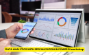
Exploring a career in Data and Business Analytics? Apply Now!
This guide provides a comprehensive overview of Tableau and Power BI, their functionalities, differences, and practical tips for creating impactful dashboards in 2026.
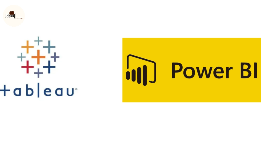
What is Tableau?
Tableau is a powerful data visualization tool that allows users to connect to multiple data sources, analyze data interactively, and create rich visual dashboards. It is widely used for business intelligence, reporting, and storytelling through data.
How Tableau Works:
- Connects to databases, spreadsheets, and cloud services.
- Allows drag-and-drop creation of charts, graphs, and dashboards.
- Supports live connections or data extracts for fast performance.
- Offers advanced analytics like trend lines, forecasting, and clustering.
Key Features of Tableau:
- Interactive dashboards and visualizations
- Easy integration with various data sources
- Real-time analytics and refresh
- Storytelling features to guide decision-making
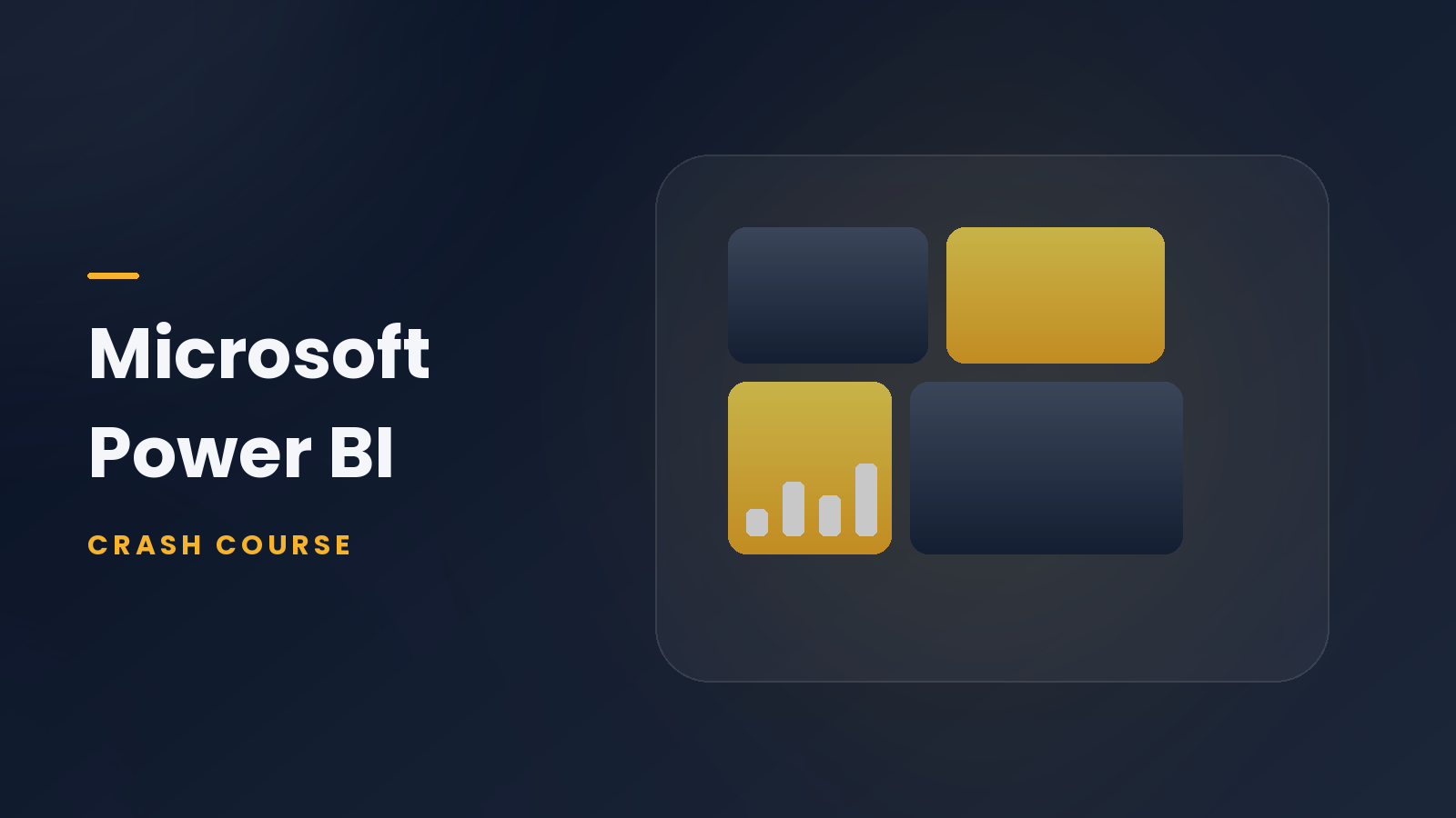
What is Power BI?
Power BI is Microsoft’s business analytics and visualization platform that transforms raw data into interactive reports and dashboards. It is designed to integrate seamlessly with Microsoft tools like Excel, Azure, and SQL Server, making it popular in enterprise environments.
How Power BI Works:
- Connects to multiple data sources, including cloud and on-premises databases.
- Uses Power Query for data transformation and cleaning.
- Provides drag-and-drop dashboard creation with built-in visualizations.
- Supports DAX formulas for advanced calculations and analytics.
Key Features of Power BI:
- Integration with Microsoft ecosystem
- Real-time dashboards and data refresh
- Custom visualizations and marketplace extensions
- Advanced analytics using DAX and AI capabilities
Tableau vs Power BI: Key Differences
|
|
|
|
|
|
|
|
|
|
|
|
|
|
|
|
|
|
|
|
|
|
|
|
|
|
|
|
Essential Tips for Tableau & Power BI
1. Plan Your Dashboard Layout
- Focus on clarity: place KPIs, charts, and tables logically.
- Use white space to prevent overcrowding.
2. Choose the Right Chart Types
- Bar/Column Charts: Compare categories
- Line Charts: Track trends over time
- Scatter Plots: Show relationships
- Maps: Visualize geographic data
- Pie Charts: Use sparingly for proportion
3. Use Interactivity
- Filters, slicers, and drill-downs let users explore data dynamically.
- Tooltips add context without cluttering visuals.
4. Highlight Key Insights
- Use color, size, and labels strategically.
- Position critical metrics prominently on dashboards.
5. Optimize Performance
- Limit large calculations and unnecessary visuals.
- Aggregate data when possible to reduce load.
- Use extracts in Tableau or optimized queries in Power BI.
6. Tell a Story
- Guide viewers through a narrative: context → trends → insights → recommendations.
- Add annotations or highlights to emphasize key takeaways.
Advanced Tricks
- Calculated Fields: Create metrics like ratios, growth percentages, or rolling averages.
- Conditional Formatting: Highlight values above/below thresholds dynamically.
- Custom Visuals: Power BI marketplace or Tableau extensions can enhance visualization options.
- Integration: Combine data from multiple sources for holistic dashboards.
- Forecasting & Analytics: Use Tableau or Power BI’s built-in trend lines, clustering, or predictive analytics tools for deeper insights.
Conclusion
Mastering Tableau and Power BI is about more than making charts it’s about turning complex data into actionable insights. By understanding how each tool works, their differences, and applying best practices, you can create impactful dashboards, communicate data effectively, and drive business decisions.
In 2026, strong data visualization skills are essential for analysts, managers, and decision-makers to remain competitive and deliver real-world impact.
Aspiring for a career in Data and Business Analytics? Begin your journey with a Data and Business Analytics Certificate from Jobaaj Learnings.