
 Categories


In the world of web development, there’s one term that has gained tremendous popularity over the years: Responsive Website Design. But what does this term really mean, and why is it so crucial for modern websites? Let’s dive into the world of responsive design, its importance, and how it can drastically improve user experience and business outcomes.
Exploring a career in Web Development? Apply now!
What Is Responsive Website Design?
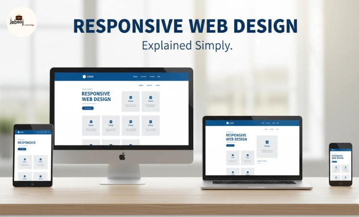
Responsive website design is a web design approach aimed at creating websites that provide an optimal viewing and interaction experience across a wide range of devices. Whether the user is on a desktop computer, a tablet, or a mobile phone, responsive websites automatically adjust and rearrange their layout, images, text, and navigation to ensure that users can access content in the most convenient and user-friendly way possible.
In simple terms, responsive design allows a website to look and function well on all devices, whether it's a desktop screen, a laptop, a tablet, or a smartphone.
Why Is Responsive Website Design Important?
1.Growing Mobile Traffic
As mobile internet usage continues to increase, it’s no longer enough for websites to work well on desktop browsers. According to recent statistics, over 50% of global web traffic now comes from mobile devices. If your website isn’t optimized for mobile users, you could be losing out on significant traffic and potential customers.
2.Better User Experience
A responsive website adapts to the user’s screen size and resolution, which ensures an intuitive and engaging experience. Users no longer have to pinch, zoom, or scroll sideways to view content everything adjusts smoothly for them. A better user experience leads to higher engagement, increased time spent on-site, and higher conversion rates.
3.Improved SEO Rankings
In 2026, search engines like Google prioritize mobile-friendly websites in their search rankings. Google’s mobile-first indexing ensures that websites optimized for mobile get a ranking boost. Responsive websites eliminate the need for multiple versions of a site (e.g., a desktop version and a mobile version), streamlining SEO efforts and improving site visibility.
4.Cost and Time Efficiency
Instead of creating separate versions of a website for mobile and desktop users, a responsive design requires just one version. This saves time and money in both development and maintenance, as updates or changes only need to be made once.
5.Adaptability for Future Devices
One of the best things about responsive design is that it’s future-proof. As new devices with varying screen sizes enter the market, your responsive website will continue to adapt, ensuring that your site remains accessible on upcoming technology.
How Does Responsive Design Work?
Responsive web design works by using CSS (Cascading Style Sheets) and media queries. Media queries allow the website to detect the device’s screen size and apply different styles accordingly. The design adjusts based on the device's characteristics, such as its screen width, resolution, and orientation.
1.Fluid Grid Layouts:
Instead of defining layout sizes in fixed pixels, responsive designs use relative units such as percentages. This ensures that elements scale proportionally to fit various screen sizes.
2.Flexible Images:
Images are scaled to fit within the layout, making sure they don’t stretch or break the design. This ensures that images look crisp and clear without slowing down load times.
3.Media Queries:
Media queries are a key part of responsive design. They allow the website to change its layout depending on the device’s properties, such as screen width, height, and resolution. For example, a layout might switch from a multi-column design on a desktop to a single-column design on a smartphone.
Examples of Responsive Website Design in Action
1.E-commerce Websites
Consider popular e-commerce platforms like Amazon or Etsy. These websites ensure that no matter what device a shopper is using, the product images, descriptions, and checkout process are accessible and easy to use.
2.News Websites
News outlets like The New York Times and BBC use responsive design to ensure that their articles and headlines are displayed clearly, whether on a laptop, tablet, or phone. The user can easily read articles, watch videos, and share content from any device.
3.Personal Blogs
Many bloggers choose responsive web design to give readers the ability to enjoy their content on any device. Whether it’s a recipe blog or a travel blog, responsive design helps ensure that the content remains easily readable and navigable.
The Key Elements of Responsive Website Design
1.Mobile-First Design
With mobile usage skyrocketing, responsive websites are often designed with mobile-first in mind. This means starting with the mobile version of the website and gradually expanding the design to fit larger screens. By prioritizing mobile users, businesses can create a better overall user experience.
2.Optimized Content
Responsive design ensures that content is prioritized and easy to read on smaller screens. Text size, line spacing, and image sizes are all adjusted for the best possible mobile viewing experience.
3.Faster Load Times
A responsive website also means faster loading speeds. By optimizing images, reducing unnecessary elements, and using modern web technologies, the website can load efficiently on any device. Faster load times translate into better user experiences and better SEO performance.
Best Practices for Responsive Web Design
1.Use a Responsive Framework
Frameworks like Bootstrap or Foundation come with pre-built components and grid systems that make it easier to build responsive websites. These frameworks automatically adjust the layout to fit different screen sizes.
2.Test on Multiple Devices
It’s essential to test your website on various devices to ensure that the design looks good and functions properly. Tools like BrowserStack allow you to test how your site looks on multiple devices and browsers, ensuring a consistent experience for all users.
3.Prioritize Content for Mobile
Mobile users generally prefer streamlined experiences with minimal clutter. Ensure that your mobile site has a clear call to action, easy navigation, and a focus on content that’s most important to the user.
4.Keep Navigation Simple
On smaller screens, complex navigation can overwhelm users. Keep your menus simple, with clear headings and icons, and consider using a hamburger menu or a simplified navigation bar.
The Future of Responsive Web Design
As technology continues to evolve, so too will responsive web design. With the rise of foldable smartphones, 5G internet, and even smart TVs, websites will need to adapt to an even broader range of screen sizes and devices. Future advancements in AI, VR (Virtual Reality), and AR (Augmented Reality) will also influence how websites interact with users.
In the future, websites might offer even more immersive experiences, adjusting based on user preferences, behaviors, and the context of their environment. Whether it's through voice commands, gestures, or even haptic feedback, the future of responsive design is limitless.
Conclusion
Responsive website design is no longer a luxury; it’s a necessity. In 2026, businesses and individuals need to prioritize responsive design to stay relevant in a mobile-first world. Whether you’re building a personal blog, e-commerce platform, or a corporate website, responsive design ensures that your content is accessible, engaging, and user-friendly on all devices.
By following best practices, testing regularly, and staying up to date with the latest trends in web design, you can create websites that provide seamless user experiences, drive more traffic, and ultimately lead to more conversions and customer satisfaction. In today’s digital landscape, a responsive website is the foundation of a successful online presence.
Dreaming of a Web Development Career? Start with Web Development Certificate with Jobaaj Learnings.


