
 Categories


In the ever-evolving world of web design, CSS (Cascading Style Sheets) continues to be a cornerstone for creating beautiful and functional websites. While basic CSS can help you style simple pages, the modern web demands more complex, dynamic, and interactive designs. This is where advanced CSS techniques come into play. They allow designers to push the boundaries of traditional web design and create stunning visuals that engage users and enhance user experience.
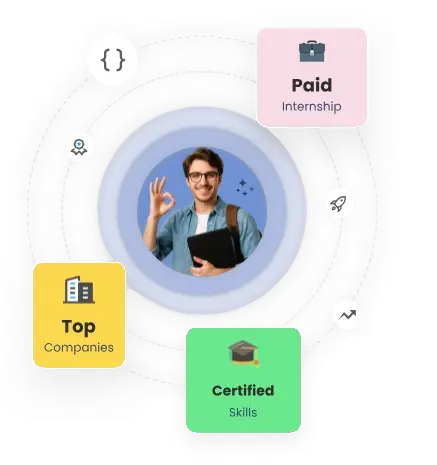
Exploring a career in Web Development? Apply now!
In this blog, we’ll explore advanced CSS techniques that can transform your designs. These techniques not only make your website visually appealing but also improve performance, responsiveness, and overall usability. Whether you’re a beginner looking to level up your CSS skills or an experienced designer wanting to learn some new tricks, these techniques will help you stay ahead in the game.
1. CSS Grid Layout: The Power of Two-Dimensional Design
The CSS Grid Layout is a game-changer when it comes to designing complex, multi-column layouts. Unlike Flexbox, which works on a single axis (either rows or columns), CSS Grid enables you to design two-dimensional layouts, giving you control over both rows and columns simultaneously.
Why Use CSS Grid?
-
Precise Control: It allows you to create layouts with absolute control over the structure, position, and alignment of elements.
-
Responsiveness: Grids are great for responsive web design. You can create fluid layouts that adapt to various screen sizes without the need for complex media queries.
Example:
Here’s a simple example of how to create a basic grid layout:
.container { display: grid; grid-template-columns: repeat(3, 1fr); gap: 20px; } .item { background-color: #f4f4f4; padding: 20px; text-align: center; }
This will create a grid with three equal-width columns and a 20px gap between them. You can easily adjust the number of columns, rows, and their proportions to suit your design.
2. CSS Variables: Dynamic Styling Made Easy
CSS Variables, also known as Custom Properties, are a powerful feature that allows you to define reusable values in your CSS. They are especially useful for theming and maintaining consistency across large projects.
Why Use CSS Variables?
-
Maintainability: By defining variables, you can easily change the color scheme, font sizes, or spacing of your entire website by altering just one value.
-
Dynamic Styling: CSS variables can be updated dynamically with JavaScript, enabling you to create interactive themes and layouts.
Example:
:root { --primary-color: #3498db; --font-size: 16px; } body { font-size: var(--font-size); color: var(--primary-color); }
In this example, you define --primary-color and --font-size as variables at the root level and use them throughout the stylesheet. Now, if you want to change the primary color across the site, you only need to update the variable.
3. CSS Animations and Transitions: Bringing Your Website to Life
While static websites were the norm in the past, modern websites rely heavily on animations and transitions to create an engaging user experience. CSS allows you to animate properties like colors, position, opacity, and more.
Why Use Animations and Transitions?
-
Engagement: Small animations can delight users and make your website feel interactive. From buttons that change color on hover to images that zoom when clicked, animations capture attention.
-
Performance: CSS animations are typically more performance-efficient than JavaScript-based animations, as they can run on the GPU, reducing load on the CPU.
Example of a Hover Transition:
.button { background-color: #3498db; padding: 10px 20px; border: none; border-radius: 5px; cursor: pointer; transition: background-color 0.3s ease; } .button:hover { background-color: #2ecc71; }
Here, when the user hovers over the button, it smoothly transitions from blue to green. This subtle effect creates a polished, interactive feel.
4. Flexbox: The Magic of One-Dimensional Layouts
Although CSS Grid is great for two-dimensional layouts, Flexbox is still the go-to solution for one-dimensional layouts (either rows or columns). Flexbox provides a simpler way to align and distribute items inside a container, making it perfect for creating responsive designs that adjust automatically to screen sizes.
Why Use Flexbox?
-
Alignment: Flexbox makes it easy to align items both horizontally and vertically.
-
Responsiveness: Flexbox helps create responsive layouts by distributing space evenly among items in a container, making them adjust to screen sizes.
Example:
.container { display: flex; justify-content: space-between; } .item { width: 30%; background-color: #f4f4f4; padding: 20px; text-align: center; }
This creates a row of three items, evenly spaced across the container. The layout will automatically adjust if the window size changes.
5. CSS Clipping and Masking: Cutting Out Custom Shapes
Sometimes, you want to create custom shapes on your website, and CSS gives you the ability to do this with clipping and masking techniques. Clipping lets you “cut” a shape from an element, and masking allows you to control its visibility.
Why Use Clipping and Masking?
-
Creative Design: Clipping and masking let you add unique design elements like circular images, irregular shapes, and masked content.
-
Control Over Shapes: You can control the area that is visible, giving your site a creative edge.
Example of a Clipped Circle:
.image { width: 200px; height: 200px; background-image: url('image.jpg'); background-size: cover; clip-path: circle(50%); }
In this example, the image is clipped into a circle. This can be a fun way to add variety to your design, especially for profile pictures, buttons, and other elements.
6. Responsive Web Design with Media Queries
Responsive design is no longer an option – it’s a necessity. Media queries allow you to apply different styles based on the device's screen size or resolution. With the rise of mobile-first design, media queries help ensure your site looks good on both desktop and mobile devices.
Why Use Media Queries?
-
Adaptability: Media queries allow you to adjust your layout for different screen sizes, ensuring a seamless experience for users on desktops, tablets, and smartphones.
-
Mobile-First Approach: With mobile traffic increasing, designing mobile-first layouts ensures that your site functions well on smaller screens and adapts as screen sizes increase.
Example:
/* Mobile Styles */ body { font-size: 14px; } /* Tablet Styles */ @media screen and (min-width: 768px) { body { font-size: 16px; } } /* Desktop Styles */ @media screen and (min-width: 1024px) { body { font-size: 18px; } }
With media queries, you can adjust the font size depending on the device's screen width, ensuring the text is legible on all devices.
Conclusion
In the world of modern web design, advanced CSS techniques are essential for creating visually appealing, responsive, and efficient websites. By mastering CSS Grid, Flexbox, animations, and other powerful techniques, you can take your website’s design to the next level. Whether you're looking to create beautiful layouts, interactive animations, or unique designs, these CSS techniques will help you stay at the forefront of web design and development.
As web standards continue to evolve, staying up to date with the latest CSS features will not only enhance the design and functionality of your websites but will also improve the user experience, which is the key to retaining visitors and customers.
Dreaming of a Web Development Career? Start with Web Development Certificate with Jobaaj Learnings.


