Categories




















Knowing Excel formulas is useful. But employers are rarely impressed by a spreadsheet containing a few calculations and colourful charts.
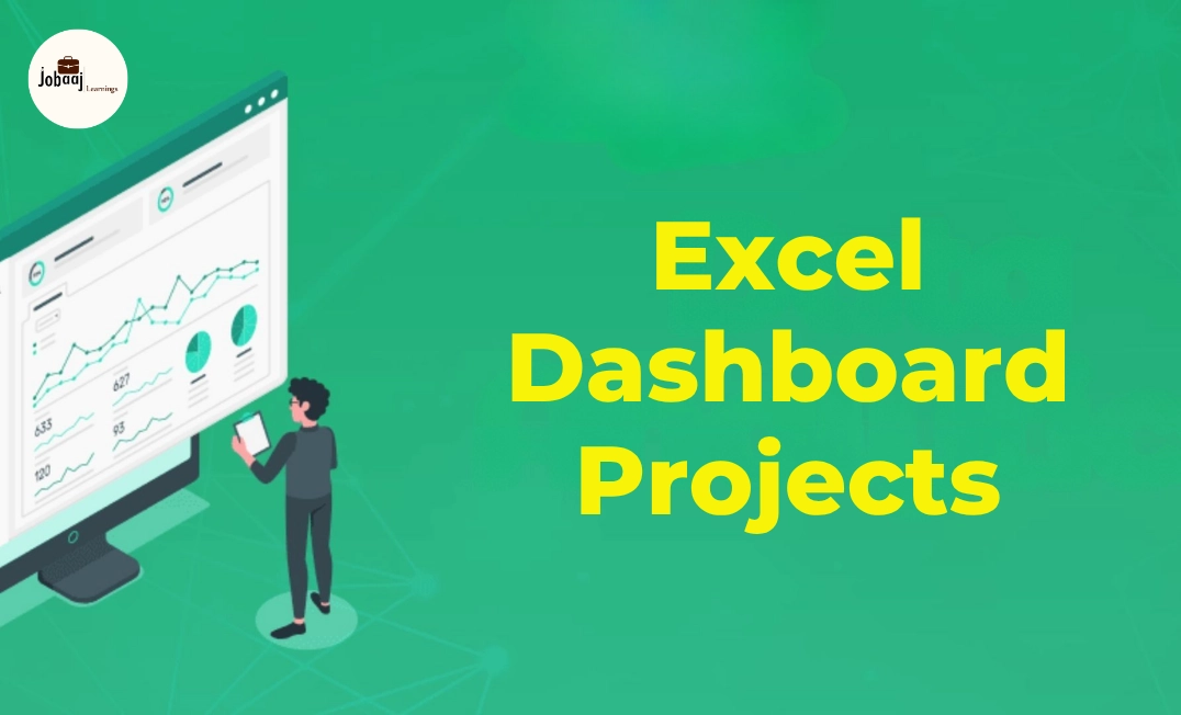
They want to see whether you can take messy data, identify a business problem, find meaningful patterns and present the results in a way that supports decisions. That is exactly what a well-designed Excel dashboard demonstrates.
For students exploring analytics as a creative career option, dashboard projects offer an accessible starting point. You can combine data, design, business thinking and storytelling without needing advanced programming knowledge.
This guide covers practical Excel dashboard projects for analytics students, the skills required to build them, suitable datasets, career opportunities, salary expectations and ways to turn each project into a strong portfolio case study.
Why Excel Dashboard Projects Matter for Analytics Students
A certificate can show that you completed a course. A dashboard shows what you can actually do.
When recruiters review an entry-level analytics portfolio, they usually want evidence that the candidate can:
- Clean and structure raw business data
- Select relevant key performance indicators
- Build reliable calculations
- Identify trends and unusual patterns
- Create interactive reports
- Explain findings in simple business language
- Recommend possible actions
Excel remains widely used across finance, sales, marketing, operations, human resources and supply chain teams. Even companies using Power BI, Tableau or cloud-based analytics platforms frequently use Excel for quick analysis, reporting and data validation.
The broader career outlook also supports developing these capabilities. The World Economic Forum identifies analytical thinking as a critical workplace skill, while AI, big data and technological literacy are among the fastest-growing skill areas through 2030. Creative thinking is also becoming more important, making dashboard development a useful combination of technical and creative ability.
15 Best Excel Dashboard Projects for Analytics Students
1. Retail Sales Performance Dashboard
A retail sales dashboard is one of the best beginner Excel projects because the business metrics are easy to understand.
Students can analyse sales by product, city, category, salesperson and month. The dashboard can help managers identify high-performing products and regions where sales are declining.
Important KPIs
- Total revenue
- Total orders
- Average order value
- Units sold
- Month-over-month growth
- Top-selling product
- Sales by region
Skills Demonstrated
PivotTables, PivotCharts, slicers, date analysis, conditional formatting and basic business interpretation.
2. E-Commerce Profitability Dashboard
Sales alone do not reveal whether an online business is performing well. This project examines the relationship between revenue, discounts, shipping costs and profit.
Students can analyse whether high-selling categories are genuinely profitable or simply producing volume with weak margins.
Important KPIs
- Gross sales
- Net sales
- Total profit
- Profit margin
- Discount percentage
- Shipping cost per order
- Return rate
- Customer lifetime value
This project is particularly valuable for aspiring business analysts, e-commerce analysts and category analysts.
3. Human Resources Attrition Dashboard
An HR dashboard examines why employees leave an organisation. It can include data on age, salary, overtime, department, job satisfaction and years of service.
Students should avoid claiming that a factor caused attrition unless the analysis supports causation. A dashboard can identify relationships and patterns, but correlation alone does not establish cause.
Important KPIs
- Total employees
- Employees who left
- Attrition rate
- Average tenure
- Attrition by department
- Overtime attrition rate
- Average monthly income
- Gender and age distribution
Creative Element
Create an employee-risk segmentation based on factors such as overtime, tenure and satisfaction. Clearly label it as an exploratory model rather than a confirmed prediction.
4. Personal Finance and Budget Dashboard
A personal finance dashboard is useful for students who want a relatable project without needing confidential company data.
The dashboard can monitor income, expenses, savings, investments and budget variance across different months.
Important KPIs
- Total income
- Total expenses
- Monthly savings
- Savings rate
- Budget variance
- Highest expense category
- Recurring expenses
- Emergency fund progress
This project can also be adapted for freelancers, households or small businesses.
5. Digital Marketing Campaign Dashboard
This project analyses the performance of campaigns running across Google, Meta, email and other marketing channels.
Students can compare which platform generates clicks, leads, conversions and revenue at an efficient cost.
Important KPIs
- Impressions
- Click-through rate
- Cost per click
- Leads generated
- Conversion rate
- Cost per acquisition
- Return on ad spend
- Revenue by campaign
6. Student Academic Performance Dashboard
This dashboard can help schools or colleges examine attendance, marks, subject performance and pass rates.
Students can compare academic results across classes, subjects, semesters and demographic groups while avoiding unnecessary exposure of personal student information.
Important KPIs
- Average score
- Attendance rate
- Pass percentage
- Subject-wise performance
- Highest and lowest scores
- Students requiring support
- Improvement from the previous term
This is a suitable first project because educational datasets are easy to understand and explain during interviews.
7. Hospital Operations Dashboard
A hospital dashboard can track patient admissions, waiting times, department workload and treatment costs.
Medical datasets require careful handling. Use public, anonymised or completely fictional data and never include personally identifiable patient information.
Important KPIs
- Total patients
- Average waiting time
- Bed occupancy rate
- Average length of stay
- Readmission rate
- Department-wise admissions
- Treatment cost
- Patient satisfaction score
This project can support applications for healthcare analyst, operations analyst and MIS reporting roles.
8. Supply Chain and Inventory Dashboard
An inventory dashboard helps businesses maintain enough stock without tying up excessive money in unsold items.
Students can analyse stock levels, demand, supplier delays and the movement of products across warehouses.
Important KPIs
- Current inventory
- Inventory turnover
- Days of inventory
- Reorder level
- Stockout rate
- Supplier lead time
- Dead stock value
- Fast- and slow-moving products
This is one of the strongest business analytics projects because it connects analysis directly to cost control and customer service.
9. Customer Churn Dashboard
A churn dashboard explores which customers stop using a product or service and what characteristics they share.
A student can use telecom, subscription, banking or software customer data to examine churn across contract types, payment methods and customer tenure.
Important KPIs
- Total customers
- Customers lost
- Churn rate
- Retention rate
- Revenue lost to churn
- Churn by plan
- Churn by tenure
- Churn by customer segment
Use Excel to segment customers, then present possible retention actions for high-risk groups.
10. Call Centre Performance Dashboard
This project tracks how efficiently a customer-support team handles calls and resolves problems.
It is suitable for students targeting operations, customer experience and workforce management roles.
Important KPIs
- Total calls received
- Calls answered
- Abandonment rate
- Average handling time
- First-call resolution
- Customer satisfaction
- Agent productivity
- Peak calling hours
A strong analysis may help managers adjust shifts, identify training needs or improve response times.
11. Recruitment Funnel Dashboard
A recruitment dashboard follows candidates through stages such as application, screening, interview, offer and joining.
It can help HR teams understand where candidates drop out and which hiring channels deliver suitable applicants.
Important KPIs
- Total applications
- Shortlisting rate
- Interview conversion rate
- Offer acceptance rate
- Joining rate
- Time to hire
- Cost per hire
- Source-wise conversions
This dashboard is especially relevant for students interested in people analytics or recruitment operations.
12. Loan Portfolio and Credit Risk Dashboard
This advanced project examines loan amounts, repayment behaviour, defaults and borrower profiles.
Students should frame the project as an educational risk analysis. A simplified Excel model should not be presented as a substitute for a regulated credit-scoring system.
Important KPIs
- Total loan value
- Active loans
- Default rate
- Average loan size
- Amount overdue
- Repayment rate
- Default by income group
- Loan performance by category
This project can strengthen applications for banking, finance and risk analyst positions.
13. Restaurant Performance Dashboard
A restaurant dashboard can combine order data, menu performance, food costs, discounts and customer ratings.
Students can identify popular dishes, low-margin products, busy hours and differences between dine-in and delivery orders.
Important KPIs
- Total orders
- Gross sales
- Average order value
- Food cost percentage
- Profit per menu item
- Discount cost
- Peak ordering hour
- Customer rating
This is a creative Excel project because it combines financial analysis, customer behaviour and menu strategy.
14. Social Media Content Dashboard
A social media dashboard measures how different content formats perform across platforms.
Students can compare reels, carousels, photographs and educational posts using engagement, reach and follower growth.
Important KPIs
- Total reach
- Impressions
- Engagement rate
- Follower growth
- Profile visits
- Link clicks
- Video completion rate
- Best-performing content type
Avoid focusing only on likes. Connect content performance with meaningful outcomes such as profile visits, enquiries or website clicks.
15. Project Management Dashboard
A project management dashboard helps teams track deadlines, budgets, workloads and task completion.
Students can build a Gantt-style timeline, overdue-task tracker and project health summary using formulas and conditional formatting.
Important KPIs
- Total tasks
- Completion percentage
- Overdue tasks
- Budget used
- Planned versus actual cost
- Milestone status
- Team workload
- Project risk level
This project is useful for business analyst, project coordinator and operations roles.
Excel Tools and Features Students Should Learn
A portfolio-ready dashboard should demonstrate more than basic formatting.
|
Excel feature |
How it helps |
|
Excel Tables |
Creates structured and expandable datasets |
|
PivotTables |
Summarises large datasets quickly |
|
PivotCharts |
Converts summaries into visual reports |
|
Slicers |
Adds interactive filtering |
|
Power Query |
Imports, cleans and combines data |
|
Power Pivot |
Creates data models and relationships |
|
XLOOKUP |
Retrieves matching data from another table |
|
SUMIFS and COUNTIFS |
Calculates results using multiple conditions |
|
IF and IFERROR |
Builds conditional logic and handles errors |
|
INDEX and MATCH |
Performs flexible lookups |
|
Conditional Formatting |
Highlights risks, targets and exceptions |
|
Data Validation |
Creates controlled input lists |
|
Dynamic Arrays |
Builds flexible results using functions such as FILTER, SORT and UNIQUE |
How to Present an Excel Dashboard in Your Portfolio
Do not upload only the finished workbook. Present the project as a short case study.
Include:
- Project objective: What business problem did you analyse?
- Dataset: Where did it come from, and what did it contain?
- Cleaning process: Which data-quality issues did you resolve?
- Tools used: Mention Excel, Power Query, PivotTables or Power Pivot.
- Dashboard features: Explain the filters, KPIs and visualisations.
- Key findings: Share the most important patterns.
- Recommendations: Explain what the business could do next.
- Limitations: State what the dataset could not prove.
Add screenshots and a 60–90 second screen-recorded walkthrough. Keep the workbook clean, label every sheet and remove unused calculations before sharing it.
Frequently asked questions
Which Excel dashboard project is best for a beginner?
A retail sales or personal finance dashboard is usually the easiest starting point. Both use familiar metrics such as revenue, expenses, profit and monthly growth. Beginners can build them using Excel tables, basic formulas, PivotTables, charts and slicers before moving to Power Query or advanced data modelling.
Can Excel dashboard projects help me get a data analyst job?
Yes, but the projects must demonstrate analysis rather than decoration. Recruiters should be able to see how you cleaned the data, selected KPIs, discovered patterns and developed recommendations. Combining Excel projects with SQL, Power BI, basic statistics and a clear presentation can make an entry-level portfolio more competitive.
How many Excel projects should I include in my portfolio?
Three well-developed projects are generally enough for an entry-level portfolio. Select projects from different areas, such as sales, HR and supply chain. Each project should contain a working dashboard, a short problem statement, documented cleaning steps, key insights, recommendations and a brief explanation of its limitations.
Do I need VBA to create an interactive Excel dashboard?
No. Students can create useful interactive dashboards with Excel Tables, PivotTables, PivotCharts, slicers, timelines, formulas and Power Query. VBA is helpful for automating repetitive actions, but it should be learned after building strong foundations in data cleaning, calculations, visualisation and business analysis.
Where can students find datasets for Excel dashboard projects?
Students can use government open-data portals, Kaggle, university repositories, company sample datasets and Microsoft learning resources. Always check the dataset’s licence and remove personal information. If suitable data is unavailable, create a clearly labelled fictional dataset that reflects realistic business transactions and relationships.

Join 5,00,000+ Subscribers
Be a part of our ever growing community.