
 Categories


Imagine this scenario: You’ve just spent hours designing the perfect webpage. You’ve carefully planned out your content, chosen your fonts, picked your images, and made everything look amazing. But as you preview your site on different devices, you realize that it doesn’t look quite the same. On your phone, the text is too small, images are cropped, and buttons are difficult to click. Suddenly, you’re faced with the challenge of making sure your website looks great, no matter what device it’s being viewed on.
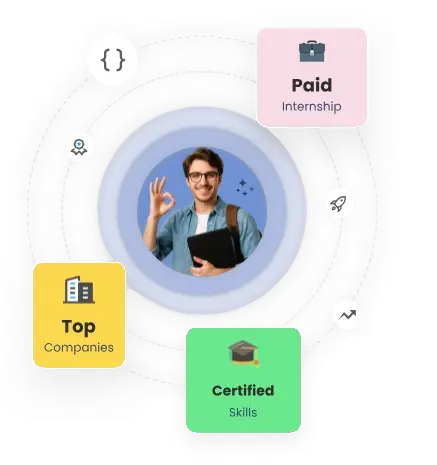
Exploring a career in Web Development? Apply now!
This is where responsive web design comes in. Responsive design ensures that your website adapts to different screen sizes, making it easy to navigate and visually appealing on everything from desktop computers to smartphones. In this post, we’ll walk you through the process of creating a responsive web page using just HTML and CSS, so you can make your website accessible to everyone, no matter what device they’re using.
What is Responsive Web Design?
Responsive web design is about creating websites that automatically adjust to fit the size of the screen they are being viewed on. Gone are the days when you had to design different versions of your website for desktop and mobile. With responsive design, a single website can look great on all devices by adapting its layout, images, and text to fit the screen size. The goal is to make your website user-friendly and accessible, no matter what device your audience is using.
Why is Responsive Web Design Important?
In today’s digital world, having a responsive website is essential for several reasons:
-
User Experience: More than half of internet traffic comes from mobile devices. If your website doesn’t look good or function properly on phones or tablets, you risk losing potential visitors. A responsive design ensures that your users have a seamless experience, whether they’re on a desktop, tablet, or phone.
-
SEO Benefits: Google ranks mobile-friendly websites higher in search results. Since responsive websites provide a better experience for users, search engines like Google give them more visibility, which can help boost your SEO rankings.
-
Cost-Effective: Instead of creating separate mobile and desktop versions of your site, a responsive design allows you to maintain just one website. This makes it easier and more cost-effective to update your content and manage your website.
Step 1: Setting Up Your HTML Structure
Before you start styling your website, it’s important to set up the basic structure using HTML. Here’s an example of a simple web page structure:
Welcome to My Website
Responsive Design Example
This webpage adjusts based on your device's screen size.
Step 2: Styling with CSS
Now that you’ve set up your HTML structure, let’s add some style to it with CSS. The key to responsive design lies in using media queries, which allow you to apply different styles based on the device's screen size. Here’s how you can style your webpage:
/* Basic styling for the page */ body { font-family: Arial, sans-serif; margin: 0; padding: 0; } header { background-color: #333; color: white; padding: 10px 0; text-align: center; } header nav ul { list-style-type: none; padding: 0; } header nav ul li { display: inline; margin-right: 20px; } header nav ul li a { color: white; text-decoration: none; } .content { padding: 20px; background-color: #f4f4f4; text-align: center; } footer { background-color: #333; color: white; text-align: center; padding: 10px 0; } /* Media Query for devices with a max width of 768px (tablets and smaller screens) */ @media screen and (max-width: 768px) { header nav ul { text-align: center; } header nav ul li { display: block; margin-bottom: 10px; } .content { padding: 10px; } } /* Media Query for devices with a max width of 480px (phones) */ @media screen and (max-width: 480px) { header { padding: 5px 0; } header h1 { font-size: 18px; } footer p { font-size: 14px; } }
Step 3: How It Works
-
Basic Layout: The basic layout includes a header with navigation links, a content section, and a footer.
-
CSS Flexibility: The navigation bar items are displayed inline by default on larger screens, but on smaller screens (tablets and phones), they stack vertically.
-
Media Queries: The
@mediarule is used to apply different styles for different screen sizes. For example:-
For screens less than 768px wide (tablets), the navigation bar items are displayed as block elements, making them stack vertically.
-
For screens less than 480px wide (phones), the header padding is reduced, and the font size of the header and footer is adjusted.
-
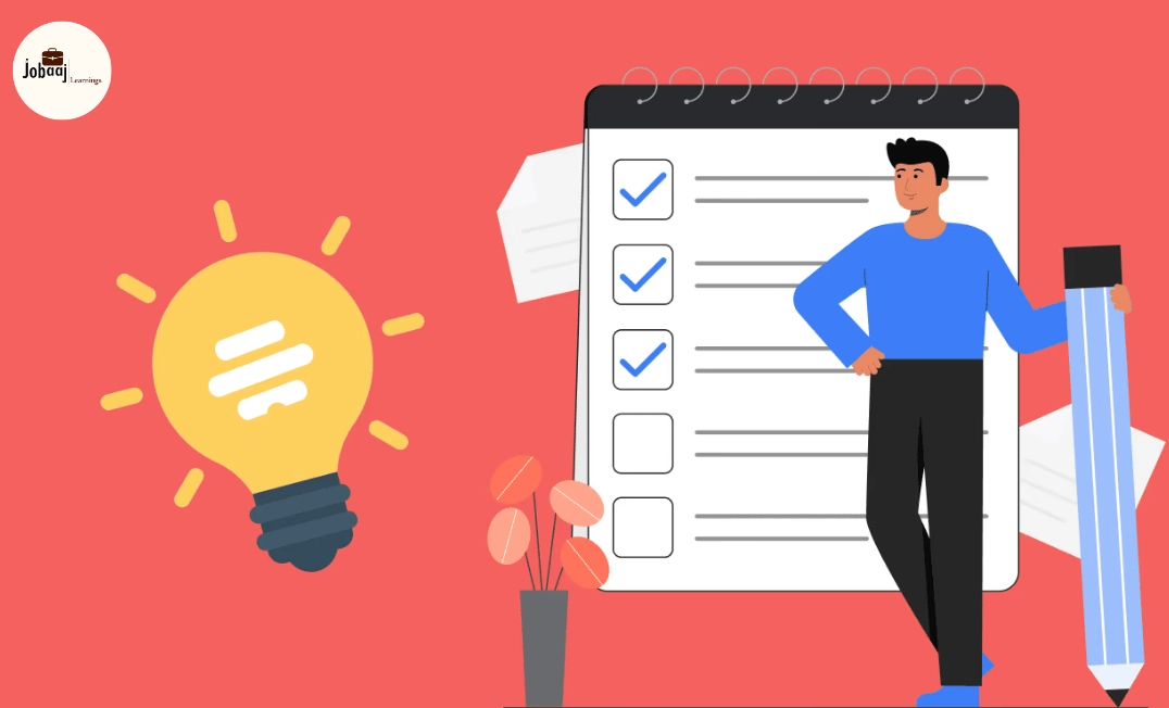
Step 4: Testing Your Web Page
Once you've set up your HTML and CSS, it’s time to test your responsive web page. You can do this by resizing your browser window or using the device emulation tools available in your browser’s developer tools. This feature allows you to simulate how your website would look on different devices, from smartphones to tablets and desktops.
By testing your design on different screen sizes, you can ensure that your website is fully optimized for all devices. This will allow you to make adjustments if anything looks out of place, ensuring your visitors have a smooth browsing experience no matter what device they are using.
Conclusion
Creating a responsive web page isn’t as complicated as it sounds. With just a little bit of HTML and CSS, you can make your website look amazing on every device. By using media queries and flexible layout techniques, you can ensure that your content is always readable, your images fit perfectly, and your users have a great experience, no matter what device they are on.
Responsive design is no longer just a good practice; it’s a necessity in today’s mobile-first world. Whether you’re building a website for your business or a personal project, making it responsive should always be a top priority. It’ll not only improve your user experience but also help with SEO, as search engines like Google favor mobile-friendly websites
Dreaming of a Web Development Career? Start with Web Development Certificate with Jobaaj Learnings.


