Categories







/content/learnings/assets/header/ManagementConsulting.svg)
/content/learnings/assets/header/InvestmentBanking.svg)











/content/learnings/assets/header/programs/1.png)
/content/learnings/assets/header/programs/4.png)

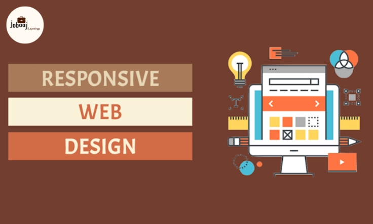
When you're building websites, one of the biggest challenges you face is ensuring that they look great and function well across a variety of devices. As screen sizes continue to diversify—from mobile phones to large desktop monitors—responsive web design has become crucial. The goal is simple: create a website that adapts seamlessly to any screen size, providing users with a consistent experience, no matter what device they’re using.
Exploring a career in Web Development? Apply now!
This is where Bootstrap comes in. Bootstrap is a popular front-end framework that allows developers to easily build responsive and mobile-first websites. It comes packed with a set of tools and components that enable quick design and layout adjustments for different screen sizes. If you're aiming to make your website responsive in 2026, Bootstrap is one of the best tools to have in your toolkit.
In this blog, we’ll explore the various elements of Bootstrap that make responsive design easier and faster. We'll cover how to use the grid system, responsive utilities, and customizations to create a responsive website that looks great on every screen.
Why Choose Bootstrap for Responsive Web Design?
Before diving into the specifics of how to use Bootstrap, let’s first understand why it’s such a popular choice for building responsive websites.
-
Ease of Use: Bootstrap offers a highly user-friendly framework. With its easy-to-understand structure and comprehensive documentation, even those with basic HTML and CSS skills can start building responsive websites quickly.
-
Mobile-First Approach: Bootstrap follows a mobile-first approach, meaning the framework was designed with small-screen devices in mind. By prioritizing mobile users, it automatically adjusts the layout of a website for smaller screens before scaling up to larger ones.
-
Grid System: Bootstrap’s powerful grid system makes it easy to create fluid layouts. It divides the screen into 12 columns, allowing you to design complex layouts that respond to different screen sizes with minimal effort.
-
Pre-Built Components: Beyond the grid system, Bootstrap also includes a wide range of pre-designed components, such as buttons, navigation bars, forms, and modals, which can be used out of the box to enhance your site’s design.
-
Consistency: One of the key benefits of Bootstrap is that it provides uniformity in design. As a developer, you can use Bootstrap to ensure that your website’s layout and components look the same across all devices, providing a consistent user experience.
Understanding Bootstrap's Grid System for Responsiveness
The grid system is one of the key components of Bootstrap that enables responsive web design. It is based on a 12-column layout, meaning you can divide your page into 12 equal parts.
To create a responsive layout, the grid system allows you to define the width of columns at different screen sizes. This makes sure that your content is flexible and adjusts accordingly as the screen size changes.
For example, on a large desktop screen, you might want to display several columns side-by-side. On smaller screens like tablets or mobile phones, you might want those columns to stack on top of each other. Using Bootstrap, you can set different column widths based on the screen size.
The beauty of this system is its flexibility. You can easily adjust the layout at different breakpoints, ensuring that your site looks great on any device.
How to Use Bootstrap’s Responsive Utilities
One of the unique features of Bootstrap is its responsive utilities, which make it easy to control how content is displayed at different screen sizes. These utilities allow you to show, hide, or change the display property of an element based on the screen size.
For example, you can make certain elements visible only on small devices, or hide them completely on larger screens. This gives you the flexibility to tailor the user experience for each device.
Responsive utilities in Bootstrap include:
-
Visibility: Show or hide content based on the screen size (e.g., showing a mobile-specific header only on smaller devices).
-
Alignment: Adjust the alignment of elements based on screen width (e.g., centering text on mobile, aligning it left on desktop).
-
Display: Control how elements are displayed (e.g., switch from block to inline-block to flex).
These utilities ensure that your website is dynamic and adapts to the user’s device, enhancing the experience.
Customizing Bootstrap for Your Needs
While Bootstrap gives you a solid foundation to build responsive websites, it also allows for a high degree of customization. While it offers default styles and components, you might want to tweak certain aspects to suit your brand or project needs. Here are a couple of ways to customize Bootstrap:
-
Overriding Bootstrap’s Styles: You can create your own custom CSS file and override the default Bootstrap styles. For example, you might want to change the primary button color, or adjust the margins and padding for a more unique look.
-
Using SASS Variables: Bootstrap is built with SASS, a CSS preprocessor. If you want to dig deeper into customization, you can download the source files, modify the SASS variables, and then recompile the files. This method gives you complete control over the grid system, colors, typography, and more.
By customizing Bootstrap, you can maintain the benefits of a responsive layout while giving your site a personalized touch that reflects your brand or project.
Implementing Responsive Design with Bootstrap
Using Bootstrap for responsive design is a straightforward process. Here’s how you can start implementing it in your next web project:
-
Start with the Container: Bootstrap’s grid system requires you to wrap your content in a container class, which centers your content and adds padding around it.
-
Use Rows and Columns: Within the container, use row to create a horizontal group of columns. Then, divide the content into columns by using col- classes.
-
Make It Responsive: To make your design responsive, use Bootstrap’s grid classes with breakpoints (e.g., col-sm-, col-md-, col-lg-) to adjust how columns are displayed at different screen sizes.
-
Use Utilities for Adjustment: As your layout evolves, use responsive utilities to hide, show, or align elements based on the screen size. This ensures a smooth user experience on any device.
By following this approach, your website will automatically adjust its layout to suit any screen size, providing a seamless experience for users, whether they’re on a mobile phone, tablet, or desktop.
Conclusion
Using Bootstrap for responsive web design in 2026 is an excellent choice for developers who want to create websites that work across all devices, without having to build custom solutions from scratch. With its easy-to-understand grid system, responsive utilities, and customization options, Bootstrap makes it simple to design modern, adaptable websites.
Whether you’re a beginner or an experienced developer, Bootstrap provides the tools you need to create responsive and mobile-first websites that deliver a consistent, engaging user experience across all platforms. So, if you haven’t already, it’s time to incorporate Bootstrap into your next web project—it will save you time and ensure your site is future-ready.
Dreaming of a Web Development Career? Start with Web Development Certificate with Jobaaj Learnings.
Frequently asked questions
How do I get started with Bootstrap for responsive web design?
To get started with Bootstrap for responsive web design, first include the Bootstrap CSS and JavaScript files in your project. You can either download them or use the CDN links. Once added, use the grid system to structure your layout and apply responsive utilities to ensure your website adjusts to different screen sizes.
What is the Bootstrap grid system?
The Bootstrap grid system is based on a 12-column layout. It allows you to divide your page into columns that can adjust based on the screen size. You can use the grid to create flexible layouts where content stacks on small devices and aligns side by side on larger ones.
How do I make my website mobile-first with Bootstrap?
Bootstrap follows a mobile-first approach by default. This means it is designed to display content appropriately on smaller screens first. By using responsive grid classes, you can adjust the layout for larger screens, ensuring that the website is optimized for mobile devices from the start.
Can I customize Bootstrap to match my brand's style?
Yes, Bootstrap is highly customizable. You can override default styles using your own CSS or modify Bootstrap’s variables using SASS. This allows you to change colors, typography, and other elements to suit your brand’s unique design while still leveraging Bootstrap’s responsive grid system.
What are Bootstrap’s responsive utilities?
Responsive utilities in Bootstrap allow you to control the visibility and alignment of elements at different screen sizes. You can use these utilities to show, hide, or adjust the layout of elements based on the screen size, enhancing the user experience on all devices.
Why should I use Bootstrap for responsive design instead of other frameworks?
Bootstrap is popular for its ease of use, comprehensive documentation, and mobile-first approach. It offers pre-built components and a flexible grid system that makes designing responsive websites faster and more efficient. Additionally, Bootstrap’s consistency across devices makes it a reliable choice for web development.

Join 5,00,000+ Subscribers
Be a part of our ever growing community.