
 Categories


Building a website from scratch can seem like an intimidating task, especially when you’re just starting out in web development. But, if you break it down step-by-step and focus on the essentials, it’s actually a fun and rewarding experience.
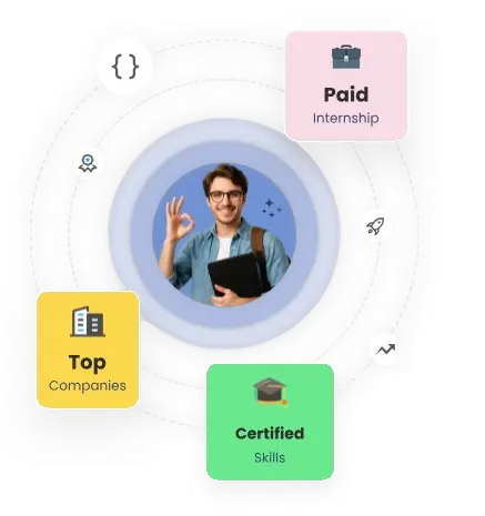
Exploring a career in Web Development? Apply now!
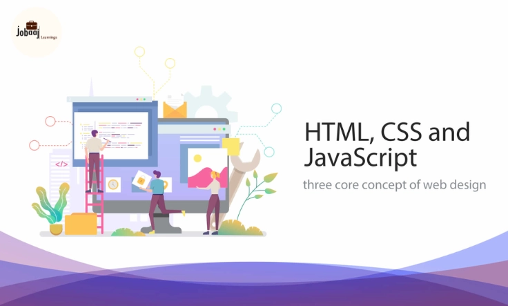
If you’ve ever wondered how websites adapt to different screen sizes and devices, then understanding responsive web design is crucial. In this guide, I’ll walk you through the process of building a responsive website from scratch using HTML, CSS, and JavaScript—and you’ll have the foundations to create websites that look great on desktops, tablets, and mobile phones.
Step 1: Setting Up Your Project Files
Before diving into coding, it’s important to organize your project. For your first responsive website, you’ll need at least three files:
-
index.html: This is the file where you'll structure your content.
-
styles.css: This file will control the appearance of your website.
-
script.js: This file will add functionality and interactivity to your website.
To get started, create these files in a folder named something like “responsive-website.” You can use any code editor you prefer (I recommend Visual Studio Code for beginners). Once that’s done, you’re ready to start working on the structure.
Step 2: Structuring Your Website with HTML
HTML (HyperText Markup Language) is the backbone of your website. It defines the structure and content, which makes it the starting point for any webpage. Let’s begin by writing some basic HTML for your website:
This website is built to adapt to different screen sizes, ensuring it looks great on mobile devices, tablets, and desktops.html lang="en" Welcome to My First Responsive Website!
/html
Here’s a breakdown of this structure:
-
: This contains meta information, such as the title and the viewport settings that are critical for responsive design. -
: This section houses the content that will be visible to the user. You have a header, a section, and a footer here.
Step 3: Styling the Website with CSS
Now, it’s time to make your website look appealing! We’ll start with CSS (Cascading Style Sheets), which controls the layout, colors, fonts, and more. For this example, let’s make sure the page is mobile-friendly and looks good on any device:
/* Reset default margin and padding */ * { margin: 0; padding: 0; } body { font-family: Arial, sans-serif; background-color: #f4f4f4; text-align: center; padding: 20px; } header { background-color: #333; color: white; padding: 10px 0; } footer { background-color: #333; color: white; padding: 10px 0; position: fixed; width: 100%; bottom: 0; } section { margin-top: 20px; padding: 20px; background-color: white; border-radius: 8px; } p { font-size: 18px; } @media (max-width: 768px) { p { font-size: 16px; } }
Key points in this CSS:
-
* { margin: 0; padding: 0; }: This resets the default margin and padding for all elements to ensure consistent styling across browsers. -
Mobile-first design: The CSS uses the
@mediaquery to change the font size when the screen width is 768px or smaller. This makes sure the page looks great on smaller devices like tablets and smartphones. -
Sticky footer: The footer stays at the bottom of the screen, no matter how long the content is.
Step 4: Making Your Website Interactive with JavaScript
JavaScript is what makes your website dynamic and interactive. It allows you to add functionality, like showing alerts or responding to user actions. Here’s a simple way to use JavaScript for an interactive button that changes the background color of the page when clicked:
// Get the button and the body element const button = document.createElement("button"); button.innerText = "Click Me!"; document.body.appendChild(button); // Add an event listener to change the background color button.addEventListener("click", function() { document.body.style.backgroundColor = "lightblue"; });
How it works:
-
The button is created dynamically and added to the page.
-
An event listener is attached to the button, so when it’s clicked, the background color of the page changes to light blue.
Step 5: Testing and Debugging
Now that you have the basic structure, styling, and interactivity set up, it's time to test your website. The most important step in responsive web design is ensuring your site looks good across different screen sizes. Here’s how to test your website:
-
Resize the Browser Window: Simply drag the edge of your browser window to resize it and observe how the website adapts.
-
Use Developer Tools: In Chrome, right-click on the page and select “Inspect” (or press Ctrl + Shift + I) to open Developer Tools. You can toggle different screen sizes here to see how your website looks on mobile, tablet, and desktop views.
Additional Debugging Tips:
-
Console: Check the Console tab in Developer Tools for any errors or warnings in JavaScript.
-
Elements: Use the Elements tab to inspect HTML structure and ensure that your CSS is applied correctly.
Step 6: Optimizing Your Website
Optimizing your website ensures that it loads quickly and runs smoothly across all devices. Here are a few ways to optimize your site:
-
Image Optimization: Resize and compress images for faster loading times. Tools like TinyPNG can help.
-
Minifying CSS and JavaScript: Use tools like UglifyJS or CSSMin to reduce file sizes by removing whitespace and comments.
-
Use Browser Caching: Enable browser caching to allow users to load your site faster on subsequent visits.
Step 7: Expanding Your Knowledge
Now that you’ve created your first responsive website, it’s time to expand your skills further. Consider learning about:
-
CSS Flexbox: A powerful tool for building flexible and responsive layouts.
-
CSS Grid: Another great tool for two-dimensional layouts.
-
JavaScript Libraries: Dive into libraries like React or Vue.js to build more dynamic websites.
Conclusion
Building a responsive website from scratch is an essential skill in modern web development. You’ve now learned how to create the basic structure of a website using HTML, style it with CSS, and add interactivity with JavaScript. By using media queries, optimizing images, and testing for different screen sizes, you’ve laid the groundwork for a mobile-friendly, responsive website.
As you continue learning, remember that web development is a journey, and each project will teach you something new. Keep experimenting, building, and testing, and soon you’ll be able to create more complex and engaging websites.
Dreaming of a Web Development Career? Start with Web Development Certificate with Jobaaj Learnings.


