Categories


Imagine opening two websites that offer the exact same service. One feels professional, trustworthy, and easy to navigate. The other looks confusing, overwhelming, or simply unappealing. The difference often comes down to one powerful design element: color.
Colors influence emotions before users read a single word. They shape first impressions, affect purchasing decisions, improve navigation, strengthen brand identity, and determine whether users stay on a website or leave within seconds.
In both web and graphic design, color is far more than decoration. It is a communication tool that guides attention, creates emotional connections, and improves user experiences.
Whether you are an aspiring designer, business owner, marketer, or student exploring creative careers, understanding color theory is one of the most valuable design skills you can develop.
What Is Color Theory?
Color theory is the study of how colors interact with one another and how they affect human perception, emotions, and behavior.
It provides designers with principles for choosing color combinations that are visually appealing, functional, and effective in communicating messages.
Color theory helps answer important questions such as:
- Which colors work well together?
- How can colors influence emotions?
- Which color combinations improve readability?
- How can brands use colors to strengthen recognition?
- How can designers guide users toward important actions?
Understanding these principles allows designers to create visuals that are both attractive and purposeful.
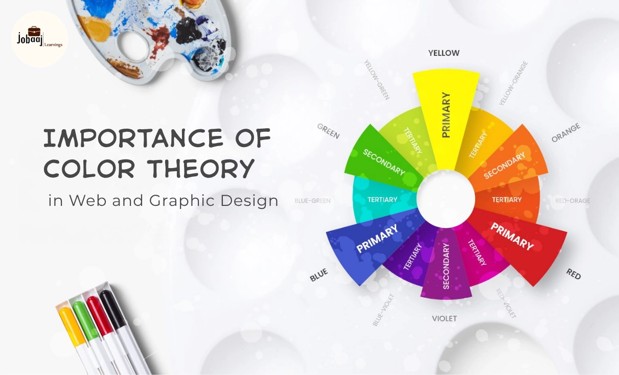
Understanding the Color Wheel
The foundation of color theory begins with the color wheel.
Primary Colors
Primary colors cannot be created by mixing other colors.
- Red
- Blue
- Yellow
These colors serve as the foundation for all other color combinations.
Secondary Colors
Secondary colors are created by mixing two primary colors.
- Green
- Orange
- Purple
Tertiary Colors
Tertiary colors result from combining a primary color with a neighboring secondary color.
Examples include:
- Blue-Green
- Yellow-Orange
- Red-Violet
These colors provide greater flexibility and sophistication in design palettes.
Why Color Theory Matters in Design
Many beginners focus on typography, illustrations, and layouts while overlooking color decisions. However, color often determines whether a design succeeds or fails.
Here are the key reasons color theory is essential.
1. Creates Strong First Impressions
Research consistently shows that people form judgments about products, websites, and brands within seconds.
Color plays a major role in these instant decisions.
When colors align with user expectations and brand values, visitors feel comfortable and confident. Poor color choices can make even professionally designed websites appear unreliable.
For example:
- Financial companies often use blue for trust and stability.
- Luxury brands frequently use black and gold for exclusivity.
- Health and wellness brands often use green to symbolize growth and wellness.
Color helps establish credibility before users even begin reading content.
2. Influences Human Emotions
Different colors trigger different emotional responses.
Although cultural differences exist, many color associations are widely recognized.
Red
Common associations:
- Energy
- Passion
- Excitement
- Urgency
Often used for:
- Sale promotions
- Food brands
- Action-oriented buttons
Blue
Common associations:
- Trust
- Security
- Reliability
- Professionalism
Frequently used by:
- Banks
- Technology companies
- Healthcare organizations
Green
Represents:
- Nature
- Growth
- Sustainability
- Balance
Popular among:
- Environmental brands
- Health products
- Financial services
Yellow
Suggests:
- Optimism
- Happiness
- Warmth
- Creativity
Often used for attracting attention and creating friendly experiences.
Purple
Associated with:
- Luxury
- Creativity
- Innovation
- Imagination
Common among beauty, fashion, and premium products.
Black
Represents:
- Sophistication
- Elegance
- Authority
- Exclusivity
Frequently used by luxury brands.
Understanding color psychology enables designers to create emotional experiences intentionally rather than accidentally.
3. Strengthens Brand Identity
Some brands are instantly recognizable through color alone.
Think about:
- Coca-Cola and its iconic red
- Facebook and its blue
- Spotify and its green
Consistent color usage increases brand recognition and creates stronger customer recall.
Studies have shown that color can significantly improve brand recognition because humans process visuals faster than text.
For businesses, choosing the right brand colors is a long-term strategic decision rather than a purely artistic choice.
4. Improves User Experience (UX)
In web design, color helps users understand interfaces quickly.
Effective color usage can:
- Highlight important buttons
- Separate content sections
- Improve navigation
- Indicate system status
- Reduce cognitive load
For example:
- Green often indicates success.
- Red typically signals errors.
- Yellow may indicate warnings.
- Blue commonly represents clickable links.
When color conventions are used consistently, users navigate websites more efficiently.
5. Enhances Visual Hierarchy
Visual hierarchy determines where users look first.
Color is one of the strongest tools for directing attention.
Designers use contrast to establish priorities.
Examples include:
- Bright call-to-action buttons against neutral backgrounds
- Highlighted promotional banners
- Important notifications in contrasting colors
- Featured content sections using accent colors
Without color hierarchy, important information can become invisible within crowded layouts.
6. Increases Conversion Rates
Color can directly influence user actions.
While no universal "best converting color" exists, strategic color choices can improve performance.
Examples include:
- More noticeable call-to-action buttons
- Better visibility for signup forms
- Improved product highlighting
- Stronger purchase motivation
The key factor is contrast rather than the specific color itself.
A button should stand out clearly from surrounding elements so users immediately recognize where to click.
Essential Color Harmony Techniques
Professional designers use established harmony principles to create balanced color palettes.
Complementary Colors
These colors sit opposite each other on the color wheel.
Examples:
- Blue and Orange
- Red and Green
- Purple and Yellow
Benefits:
- Strong contrast
- High visual impact
- Excellent attention-grabbing capability
Analogous Colors
These colors appear next to each other on the wheel.
Examples:
- Blue, Blue-Green, Green
- Yellow, Yellow-Orange, Orange
Benefits:
- Harmonious appearance
- Smooth transitions
- Calm visual experience
Triadic Colors
Three evenly spaced colors on the wheel.
Examples:
- Red, Yellow, Blue
- Green, Orange, Purple
Benefits:
- Balanced contrast
- Vibrant compositions
- Creative energy
Monochromatic Colors
Different shades, tones, and tints of a single color.
Benefits:
- Professional appearance
- Minimalist aesthetic
- Strong visual consistency
Many modern SaaS websites use monochromatic color systems for clean and sophisticated user interfaces.
Color Theory in Web Design
1. Navigation Clarity
Users should instantly understand where to click.
Color helps distinguish:
- Navigation menus
- Interactive elements
- Buttons
- Links
- Forms
Clear color differentiation reduces confusion and improves usability.
2. Readability and Accessibility
Good design is accessible design.
Poor color combinations create serious readability issues.
Avoid combinations such as:
- Bright red on green
- Yellow on white
- Light gray on white
Instead, designers should prioritize sufficient contrast between text and backgrounds.
Accessibility standards help ensure websites remain usable for people with visual impairments and color vision deficiencies.
3. Mobile Experience
With mobile users dominating internet traffic, color choices must remain effective across various screen sizes and brightness settings.
Designers should test colors on:
- Smartphones
- Tablets
- Laptops
- Desktop monitors
Consistency across devices is critical for maintaining user trust.
Color Theory in Graphic Design
Graphic designers use color to communicate messages quickly and effectively.
Applications include:
Advertising Materials
Colors influence:
- Attention
- Engagement
- Purchase intent
- Brand recall
Social Media Graphics
Color helps content stand out in crowded feeds.
Strategic color usage can increase:
- Click-through rates
- Shares
- Engagement
- Memorability
Packaging Design
Packaging colors affect consumer perception before products are examined.
Luxury products, organic products, children's products, and technology products often rely on completely different color strategies.
Print Design
Brochures, posters, flyers, and magazines use color to organize information and create emotional responses.
Modern Color Trends in 2026
Design trends continue evolving, but several color approaches remain highly popular.
1. Soft Gradients: Smooth transitions between colors create depth and modern aesthetics.
2. Dark Mode Interfaces: Dark-themed experiences continue growing due to improved comfort and reduced eye strain.
3. Vibrant Accent Colors: Bright accent colors help key actions stand out against neutral backgrounds.
4. Nature-Inspired Palettes: Earthy greens, warm browns, and organic tones reflect increasing interest in sustainability and wellness.
5. AI-Generated Adaptive Color Systems: Modern design tools increasingly use AI to recommend optimized color combinations based on audience behavior and accessibility standards.
How Beginners Can Learn Color Theory Faster
If you are starting your design journey, focus on practical application rather than memorization.
Learn by:
- Studying successful websites and brands.
- Recreating professional color palettes.
- Practicing with design tools.
- Testing multiple color combinations.
- Understanding accessibility guidelines.
- Experimenting with branding projects.
Popular tools include:
Practical experience develops color intuition far more effectively than theory alone.