
 Categories


As we step into 2026, the way users interact with the web continues to evolve, with mobile devices becoming an even more integral part of daily life. Mobile-First Web Design is no longer just a trend; it has become a necessity for web developers, designers, and businesses to cater to an increasingly mobile-first audience. With the global use of smartphones and tablets reaching new heights, designing websites with mobile users in mind is crucial for ensuring a seamless, user-friendly experience across all devices.
Exploring a career in Web Development? Apply now!
In this blog post, we will explore why Mobile-First Web Design is essential in 2026, the benefits it brings, and the strategies you can use to implement it effectively.
Why Mobile-First Web Design Matters More Than Ever
In today’s digital landscape, more people access websites via their smartphones than desktop computers. According to recent statistics, mobile devices account for over half of all web traffic globally. With search engines like Google also prioritizing mobile-friendly websites, mobile-first design ensures that your website meets user expectations while also improving your chances of ranking higher in search results.
By focusing on mobile-first design, you ensure that your website is optimized for performance, speed, and usability on smaller screens. In turn, this contributes to a more pleasant experience for users, making them more likely to engage with your content, spend time on your site, and return in the future.
The Key Benefits of Mobile-First Web Design
-
Enhanced User Experience:
Mobile-first design emphasizes simplicity, clarity, and functionality, all of which contribute to an improved user experience. By designing with mobile users in mind, you streamline navigation, optimize page load times, and ensure that users can easily interact with the site, whether they are on a phone or tablet. -
Faster Load Times:
Mobile-first design encourages lightweight designs, which tend to load faster. Faster load times lead to lower bounce rates and higher user satisfaction. Google’s mobile-first indexing gives preference to websites that load quickly on mobile devices, which can contribute to higher rankings. -
Improved SEO:
With Google’s mobile-first indexing, your mobile site’s performance directly impacts your overall search engine rankings. Websites that prioritize mobile-friendly design tend to perform better in search results, leading to increased visibility and organic traffic. -
Increased Mobile Traffic:
A mobile-first approach ensures your site is accessible and functional for the millions of people browsing the web on their smartphones. By providing a mobile-optimized experience, you're directly catering to this growing segment of users, increasing your chances of attracting and retaining visitors. -
Responsive Design Across Devices:
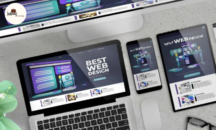
Mobile-first design often leads to a responsive website, meaning it will adapt to various screen sizes, from smartphones and tablets to desktops and laptops. This seamless experience across all devices helps keep users engaged, regardless of the device they are using.
Key Strategies for Implementing Mobile-First Design in 2026
-
Prioritize Content and Simplicity:
On smaller screens, every element needs to count. By prioritizing the most important content and features, you create a streamlined experience that doesn’t overwhelm users. Simplify your navigation, reduce clutter, and make sure the essential features are accessible with ease. -
Optimize Performance and Speed:
Mobile users expect fast-loading websites. Optimizing images, leveraging browser caching, and using lightweight design elements are crucial for ensuring fast load times on mobile devices. -
Use Mobile-Friendly Typography and Touch-Friendly Interfaces:
Ensure that your text is legible on smaller screens by using larger fonts and appropriately spaced lines. Buttons and interactive elements should be easy to tap, with enough space between them to avoid accidental clicks. -
Test and Iterate Regularly:
Mobile-first design isn’t a one-time process. Regularly test your site across different mobile devices and screen sizes to ensure it remains user-friendly and functional. Continuously collect feedback from users to identify pain points and areas for improvement.
The Future of Mobile-First Design: Looking Ahead
As technology advances and mobile devices become even more sophisticated, the importance of mobile-first web design will only continue to grow. The future of web design will likely involve more voice searches, AI-driven experiences, and integration with mobile apps, all of which will require web developers and designers to think even more deeply about the mobile user experience.
With 5G technology rolling out across the globe, internet speeds will improve, allowing for richer and more interactive mobile experiences. Mobile-first design will play an even larger role in creating websites that are both fast and interactive, offering users an experience that’s as seamless as possible.
Conclusion
In 2026, Mobile-First Web Design is no longer optional. It is an essential part of creating websites that are accessible, fast, and user-friendly, regardless of the device being used. By prioritizing mobile design, businesses ensure they’re meeting the needs of today’s on-the-go users while also improving SEO performance and future-proofing their websites.
As mobile traffic continues to grow, embracing Mobile-First Web Design will not only give you a competitive edge but also set the foundation for delivering exceptional user experiences across all devices. It’s time to embrace the mobile-first mindset and create websites that are ready for the future.
Dreaming of a Web Development Career? Start with Web Development Certificate with Jobaaj Learnings.


