Categories


Excel it's the tool that almost every office worker, analyst, and even students know and use. It’s been a staple for organizing and crunching numbers for decades. Whether you’re building a budget, analyzing sales, or studying trends, Excel is your go-to friend. But did you know that it’s packed with powerful features that can make data analysis quicker, smarter, and way more efficient?
Exploring a career in Data and Business Analytics? Apply Now!
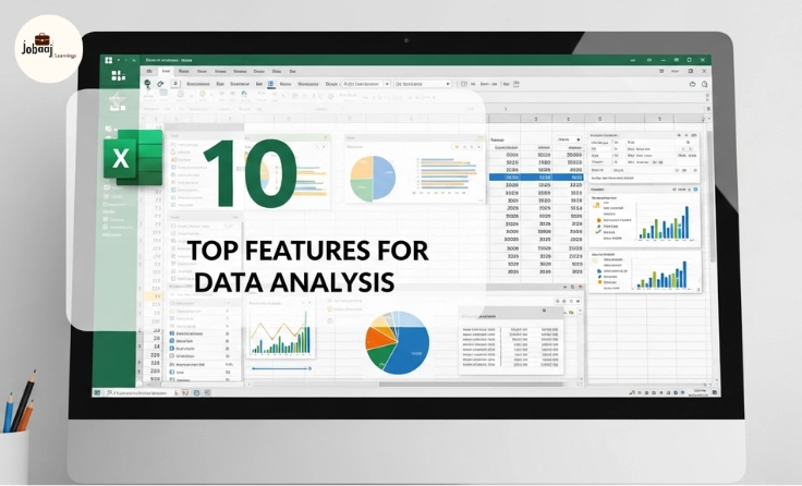
In this blog, we’ll explore the best 10 features for data analysis in Excel that will transform how you handle your data. These tools will save you time, reduce human error, and unlock insights you might have missed otherwise. Let’s dive in!
1. Pivot Tables
Imagine you have thousands of rows of data how do you make sense of all of it? That’s where Pivot Tables come in. They let you quickly summarize and analyze large datasets without breaking a sweat.
Pivot Tables allow you to manipulate your data into a more manageable and meaningful form. Want to see the total sales by region, or compare performance across different product categories? Pivot Tables can do that in seconds.
How to use it:
-
Select the data you want to analyze.
-
Click on the “Insert” tab and choose “PivotTable.”
-
Choose where you want your Pivot Table to appear and drag and drop the fields you want to analyze.
Example:
Let’s say you're tracking monthly sales data for multiple products across different regions. With a Pivot Table, you can instantly summarize which products are performing the best in each region, or which months are the peak sales periods.
2. VLOOKUP and XLOOKUP
You’ve probably been there before scrolling through endless rows and columns trying to find a specific piece of data. VLOOKUP and XLOOKUP save the day by helping you search for and retrieve data quickly.
-
VLOOKUP searches for a value in a table and returns related data from the same row.
-
XLOOKUP (a more flexible and modern replacement) allows you to look up values both vertically and horizontally, making it easier to use and more powerful.
How to use it:
-
For VLOOKUP:
=VLOOKUP(lookup_value, table_array, col_index_num, [range_lookup]) -
For XLOOKUP:
=XLOOKUP(lookup_value, lookup_array, return_array, [if_not_found], [match_mode], [search_mode])
Example:
Say you’re managing a list of employees and need to find out their department based on their employee ID. Instead of manually searching, you can use XLOOKUP to automatically find the department name that matches the employee ID.
3. Conditional Formatting
Sometimes the data you’re working with is best understood visually. With Conditional Formatting, you can automatically change the color or appearance of cells based on the data inside them.
You can highlight sales numbers above a certain threshold, flag overdue tasks, or even use color scales to visualize how certain data values compare across rows or columns.
How to use it:
-
Select your data range.
-
Click on the “Home” tab and choose “Conditional Formatting.”
-
Pick from a variety of options, such as color scales or icon sets.
Example:
If you’re tracking monthly revenue and want to quickly see which months performed best, you can apply Conditional Formatting to show higher revenues in green and lower revenues in red.
4. Power Query
Power Query is your personal assistant for cleaning, transforming, and importing data from various sources. Whether it’s from an Excel file, a CSV, or even a website, Power Query does all the heavy lifting for you.
With Power Query, you can automate the process of cleaning up data, removing duplicates, and even transforming it into a format that suits your analysis needs.
How to use it:
-
Go to the “Data” tab and select “Get Data.”
-
Choose your data source and use the Power Query Editor to transform and clean the data.
Example:
Let’s say you need to combine data from multiple sheets with customer information. Power Query allows you to merge all that data seamlessly, ensuring you don’t have to manually copy-paste everything.
5. Data Validation
Data Validation ensures that the data entered into your spreadsheet meets specific criteria, making sure that no errors sneak in.
Instead of manually checking for errors or inconsistencies, Data Validation prevents invalid data from being entered in the first place.
How to use it:
-
Select the range where you want to apply validation.
-
Go to the “Data” tab and click on “Data Validation.”
-
Set your criteria (e.g., whole numbers, dates, dropdown lists).
Example:
If you have a column for email addresses, you can set a rule to only allow valid email addresses. This prevents typos like “abc@com” from being entered.
6. Charts and Graphs
Charts and graphs turn your numbers into visuals that are easier to understand. They allow you to spot trends, compare data, and present your findings more effectively.
You can create various charts line graphs, pie charts, bar charts, and more that help you communicate your data in a way that’s both informative and visually appealing.
How to use it:
-
Select the data range you want to chart.
-
Go to the “Insert” tab and select the chart type you need.
Example:
You’re analyzing quarterly sales performance, and a bar chart can quickly show you which quarters had the highest sales. For a quick percentage breakdown, a pie chart could be more useful.
7. Solver
Solver helps you find the best possible solution to an optimization problem, like minimizing costs or maximizing profits, by adjusting variables subject to constraints.
It allows you to perform complex calculations without having to do them manually, saving time and ensuring optimal results.
How to use it:
-
Go to the “Data” tab and click on “Solver.”
-
Define the objective cell, decision variables, and constraints.
Example:
If you're managing production costs and need to find the most cost-effective production strategy, Solver helps you adjust the number of units to produce across different factories to minimize expenses.
8. Text Functions
Excel’s Text Functions allow you to manipulate and clean up textual data, which is essential when working with messy datasets or text-heavy information.
You can extract, combine, or format text data in just a few clicks. Functions like LEFT(), RIGHT(), MID(), and CONCATENATE() can quickly clean and organize large sets of textual information.
How to use it:
-
Use
LEFT()to extract the left-most characters. -
Use
MID()to extract a substring from any part of the text. -
Use
CONCATENATE()to join multiple text cells into one.
Example:
If you have a list of full names and need to separate first and last names, you can use Text Functions to extract the first name and last name into separate columns.
9. What-If Analysis
What-If Analysis allows you to test how changes in input affect outcomes, making it ideal for financial modeling or forecasting.
With What-If Analysis, you can simulate different scenarios (like changes in expenses or revenue) to make more informed decisions.
How to use it:
-
Go to the “Data” tab and select “What-If Analysis.”
-
Choose the tool that fits your needs (e.g., Scenario Manager, Goal Seek).
Example:
If you’re projecting future sales and want to see how changes in pricing affect your bottom line, What-If Analysis lets you quickly run multiple scenarios.
10. Macros
Macros allow you to automate repetitive tasks, saving you time and reducing the risk of human error.
If you find yourself doing the same thing over and over again in Excel, like formatting cells or applying formulas, a macro can do it for you automatically.
How to use it:
-
Go to the “View” tab and select “Macros.”
-
Click on “Record Macro” and complete the task you want to automate.
Example:
If you have to format reports every week, a Macro can automatically format the data, saving you time and effort.
Conclusion
Mastering these top 10 Excel features for data analysis will significantly enhance your ability to analyze, visualize, and present data efficiently. Excel is a powerful tool, and with the right knowledge, you can unlock its full potential. Whether you’re working with financial data, customer insights, or project tracking, these features will allow you to get the most out of your datasets and make more informed decisions. Start experimenting with these tools, and watch how they transform the way you approach data analysis!
Aspiring for a career in Data and Business Analytics? Begin your journey with a Data and Business Analytics Certificate from Jobaaj Learnings.