Categories


When starting a new business or rebranding an existing one, one of the most significant elements to consider is your logo. It is often the first interaction customers have with your brand and can leave a lasting impression. But, with so many styles and types to choose from, selecting the right one can be a daunting task. A logo not only represents your company visually but also communicates its personality, values, and overall message.
In 2026, brands are looking for more than just a pretty image they want a logo that speaks to their core mission and connects with their audience. This is where understanding the different types of logos becomes crucial. Whether you’re just starting out or looking to rebrand, understanding these 10 logo types will help you choose the one that best reflects your brand’s identity.
In this article, we will go through the Top 10 Logo Types, breaking down their definitions, real-world examples, and how they express your brand’s identity. Let’s dive in.
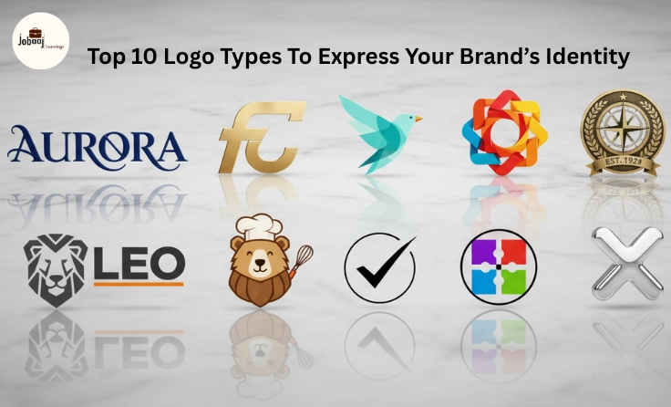
1. Wordmark Logo (Logotype)
A wordmark logo focuses on the brand’s name using stylized text. This type of logo works best when a brand has a unique name that people can easily remember. The typography and font used in a wordmark logo are crucial, as they reflect the character of the brand.
Examples: Google, Coca-Cola, Visa, Disney
Best for:
-
Brands with a short and memorable name.
-
Businesses aiming for a strong, simple, and direct identity.
How It Expresses Brand Identity:
Wordmark logos communicate a sense of clarity and straightforwardness. By focusing on the name itself, these logos ensure that the brand is memorable and easy to recall. The style of the text, whether it's modern, playful, or elegant, helps convey the tone and personality of the business.
2. Lettermark Logo
A lettermark logo uses the initials of a business’s full name to create a recognizable and compact visual representation. If your company’s name is long or difficult to remember, a lettermark can be a great choice to create a simpler version.
Examples: IBM, CNN, HP, NASA
Best for:
-
Companies with long or multi-word names.
-
Established brands or companies that are well-known by their initials.
How It Expresses Brand Identity:
Lettermarks emphasize simplicity and memorability. By distilling a company’s name into its initials, lettermark logos create a succinct version of the brand, often adding an air of sophistication and authority. The choice of font or design can greatly influence how the business is perceived.
3. Pictorial Mark
A pictorial mark uses an icon or image to represent the brand. This type of logo is visual and immediately recognizable. It often represents the product, service, or essence of the brand, and it doesn’t necessarily need words to communicate the message.
Examples: Apple, Twitter, Target, Shell
Best for:
-
Brands with a recognizable product or image.
-
Businesses that want to use imagery to evoke emotions and ideas.
How It Expresses Brand Identity:
Pictorial logos are highly visual and focus on a specific symbol that defines the brand’s identity. These logos help businesses become more recognizable and memorable by associating a symbol with their product or mission. The icon is often simple yet powerful, serving as a universal representation of the business.
4. Abstract Mark
An abstract mark logo uses geometric shapes or forms that don’t directly represent real-world objects. Instead, these logos convey a specific idea or emotion that aligns with the brand’s values. The abstract nature allows for unique and creative designs.
Examples: Pepsi, Adidas, BP, Nike (swoosh)
Best for:
-
Companies that want a unique, artistic representation.
-
Brands looking for something modern and cutting-edge.
How It Expresses Brand Identity:
Abstract logos are often futuristic and innovative, conveying the essence of the brand through unique, non-literal forms. This type of logo is highly versatile and can evoke various feelings depending on the design, such as energy, movement, or stability.
5. Emblem Logo
An emblem logo is a design that combines text and imagery in a badge-like form. These logos often look more traditional or formal and are typically used by schools, government agencies, or organizations with a legacy.
Examples: Harley-Davidson, Starbucks, BMW, Seal of the President of the United States
Best for:
-
Institutions, schools, and governmental organizations.
-
Businesses that want to convey authority and tradition.
How It Expresses Brand Identity:
Emblems often carry a sense of prestige and legacy, making them ideal for brands with a long history or those that wish to communicate trust and reliability. The intricate design allows for a richer, more detailed logo that signifies authority and professionalism.
6. Combination Mark
A combination mark combines both a symbol (or icon) and a wordmark. This type of logo allows a brand to use both visual imagery and its name together, offering flexibility in its usage.
Examples: Burger King, Lacoste, Adidas, Taco Bell
Best for:
-
Companies that want to balance both text and imagery in their branding.
-
Brands that want versatility in how they present their logo.
How It Expresses Brand Identity:
A combination mark gives the business flexibility to use the icon and text together or separately. It allows brands to make an impression through both the symbol and the name, ensuring that customers can recognize the brand in multiple formats.
7. Mascot Logo
A mascot logo uses a character or figure to represent the brand. This could be an animal, a human, or even a fictional character that helps convey a specific brand personality. Mascots are often used by family-friendly brands to create a friendly and approachable image.
Examples: KFC (Colonel Sanders), Planters (Mr. Peanut), Kool-Aid (Kool-Aid Man)
Best for:
-
Fun, engaging brands looking for an approachable and friendly identity.
-
Companies in the food, beverage, or entertainment industries.
How It Expresses Brand Identity:
Mascot logos create an emotional connection with the audience. These characters often represent the values and tone of the brand, helping businesses to appear more relatable, engaging, and fun. Mascots also help foster brand loyalty, as customers often feel a connection to the character.
8. Dynamic Logo
A dynamic logo is one that evolves or changes over time. Brands with dynamic logos often have multiple versions of their logo that change in color, form, or style depending on the context or medium.
Examples: Google, MTV, Nickelodeon
Best for:
-
Companies that want to stay fresh, modern, and adaptable.
-
Brands looking to engage audiences with creative and changing visuals.
How It Expresses Brand Identity:
Dynamic logos express a sense of evolution and modernity. They reflect a brand’s ability to adapt and stay current, offering versatility that resonates with younger, more dynamic audiences. This logo style can help keep your brand feeling fresh and relevant over time.
9. Minimalist Logo
A minimalist logo focuses on simplicity, using clean lines, geometric shapes, and limited design elements. This type of logo often employs black-and-white color schemes or a single, bold color to make a strong, lasting impression.
Examples: Apple, Nike, Chanel, Target
Best for:
-
Brands that want a sleek, sophisticated, and timeless design.
-
Companies aiming for high-end or luxury branding.
How It Expresses Brand Identity:
Minimalist logos are designed to evoke elegance, simplicity, and sophistication. By stripping down the design to its most essential elements, these logos convey clarity and timelessness, focusing on creating a memorable, streamlined visual identity.
10. Vintage/Retro Logo
A vintage or retro logo evokes nostalgia by using design elements from the past. These logos often use old-school typography, classic color schemes, and design motifs that remind customers of a bygone era.
Examples: Pepsi, Coca-Cola, Levi’s
Best for:
-
Brands that want to convey a sense of history and tradition.
-
Businesses with a long heritage or those in the food, beverage, or fashion industries.
How It Expresses Brand Identity:
Vintage logos express a sense of nostalgia and authenticity. They create a connection to the past, appealing to customers who appreciate history, tradition, and the timeless qualities of older design styles.
DIfference Between The Logo Types
|
|
|
|
|
|
|
|
|
|
|
|
|
|
|
|
|
|
|
|
|
|
|
|
|
|
|
|
|
|
|
|
|
|
|
|
|
|
|
|
|
|
|
|
Conclusion
Your logo is more than just a design; it is the cornerstone of your brand identity. Whether you choose a wordmark, a mascot, or an abstract design, your logo will play a crucial role in how your business is perceived by your audience. It’s important to pick a logo type that accurately reflects your company’s values, tone, and mission.
By understanding the different logo types and how they convey your brand’s message, you can make an informed decision that helps your brand stand out and leave a lasting impression.