Categories


Imagine you’re trying to explain a complex concept to someone—a topic filled with endless statistics, figures, and jargon. It’s tough, right? Words alone often don’t do justice to how intricate or important the subject really is. But what if you could illustrate your point using colorful charts, graphs, or maps that instantly bring the data to life? Suddenly, the concept becomes clearer, and the story you want to tell is easier to understand.
Exploring a career in Data Analytics? Apply Now!
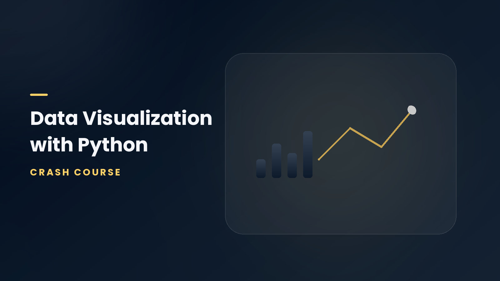
That’s the magic of data visualization. It’s not just about showing numbers on a screen; it’s about telling a story with data. Whether you’re a business leader, data analyst, or researcher, visualizing your data in an effective and engaging way can transform how your audience perceives the information. With the right tools and techniques, data visualization can turn complex datasets into simple, actionable insights.
In this blog, we’ll explore what data visualization is, the tools available to help create meaningful visuals, and some of the best techniques for displaying data effectively. Whether you're a beginner or looking to refine your skills, this guide will equip you with the knowledge to leverage the power of data visualization to communicate insights like never before.
What is Data Visualization?
At its core, data visualization is the graphical representation of information and data. By using charts, graphs, maps, and other visual tools, complex data sets become easier to understand and interpret. Instead of analyzing spreadsheets full of numbers, data visualization presents the information in a form that the human brain can process quickly, revealing patterns, trends, and outliers that might otherwise go unnoticed.
For instance, a line graph might show the progression of sales over time, while a bar chart can compare the sales of different products. This is much more intuitive than reading through rows and columns of figures.
Why is Data Visualization Important?
In today's fast-paced world, where decisions need to be made quickly, data visualization provides an immediate understanding of complex data. Here are a few reasons why it’s so crucial:
-
Clarity and Simplicity
Visualizing data helps eliminate confusion. Complex datasets that may be overwhelming when written out can become clear when represented visually. -
Better Insights
Visuals allow you to spot trends, correlations, and outliers much more quickly than raw data. These insights can guide decision-making, improve strategies, and lead to better business outcomes. -
Enhanced Communication
A picture is worth a thousand words, and when it comes to data, data visualization makes the communication of insights faster and more effective, especially for non-technical audiences. -
Increased Engagement
Interactive dashboards and engaging visualizations keep audiences interested and can lead to better retention of key information.
Popular Data Visualization Tools
To create impactful data visualizations, several tools are available to suit various needs and levels of expertise. Here are some of the top tools that can help you bring your data to life:
-
Tableau
Widely regarded as one of the best tools for creating interactive and visually stunning dashboards, Tableau is used by data professionals across industries. It allows users to connect to different data sources, create sophisticated visuals, and share insights with ease. -
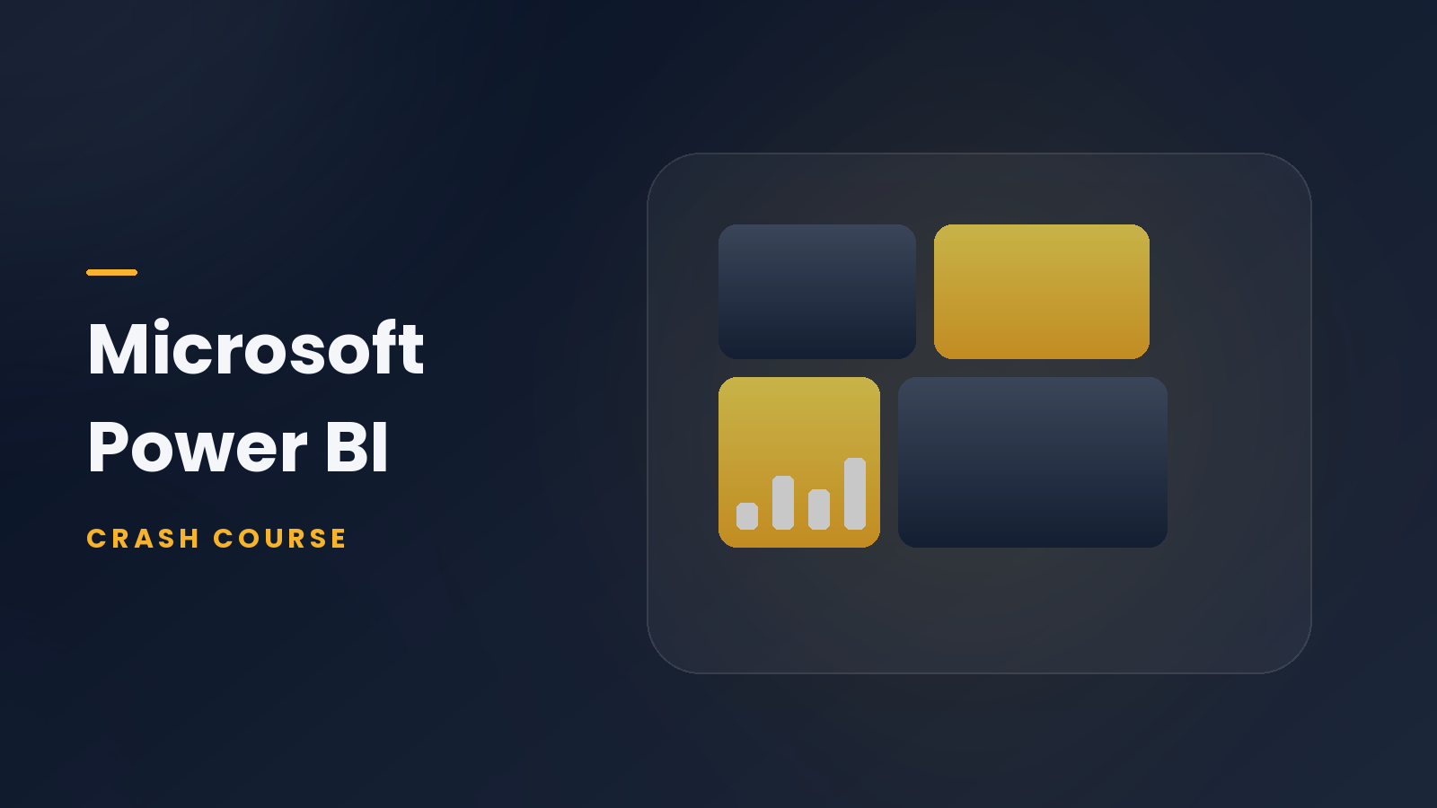
Power BI
Power BI by Microsoft is another excellent tool for business intelligence. It integrates seamlessly with Excel and other Microsoft services, making it perfect for users familiar with those platforms. It’s a great choice for creating interactive reports and visualizations. -
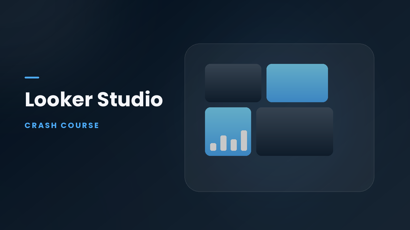
Google Data Studio
A free tool from Google, Google Data Studio allows users to turn data into customizable, easy-to-read reports and dashboards. It integrates well with Google products, such as Google Analytics and Google Sheets, making it an ideal choice for users already in the Google ecosystem. -
QlikView
Known for its strong data processing and analysis capabilities, QlikView is a great choice for businesses that need powerful visualizations alongside their data analysis. It also allows users to explore data in a more interactive way. -
D3.js
For those comfortable with coding, D3.js is a JavaScript library that enables you to create complex, interactive visualizations. It offers more flexibility and customization, but it requires a deeper understanding of coding. -
Excel
Though not as advanced as other tools, Excel remains a go-to for many because of its ease of use. With its built-in charting tools, users can quickly create graphs and charts to represent their data visually.
Best Techniques for Data Visualization
Choosing the right visualization techniques is crucial for presenting your data in the most effective way. Here are a few techniques to consider:
-
Bar and Column Charts
Ideal for comparing quantities across different categories, bar and column charts are widely used for simple comparisons. For example, you can use these charts to compare sales across different regions or products. -
Line Graphs
Line graphs are perfect for showing trends over time, such as tracking monthly sales or website traffic. They provide a clear view of how things change and help identify patterns and anomalies. -
Pie Charts
Pie charts are useful when you want to show proportions of a whole. For instance, showing how much each department contributes to a company’s total revenue. -
Heatmaps
Heatmaps provide a color-coded visualization of data to help identify patterns and relationships. They are commonly used for website analytics, where you can see which areas of a page are getting the most interaction. -
Scatter Plots
Scatter plots are used to visualize relationships between two variables. They can help identify correlations or trends in large datasets, such as tracking the relationship between marketing spend and sales performance.
Conclusion: The Power of Data Visualization in Decision Making
The future of data visualization is bright, and its role in business, science, and everyday life will only continue to grow. As we are inundated with more data than ever before, the ability to effectively visualize and communicate insights from that data is becoming increasingly important.
Whether you are a business leader, data analyst, or researcher, understanding how to create meaningful, engaging visualizations can transform how you interpret and communicate data. With the right tools and techniques, data visualization will not only help you understand your data but also help you make smarter, more informed decisions.
Dreaming of a Data Analytics Career? Start with Data Analytics Certificate with Jobaaj Learnings.